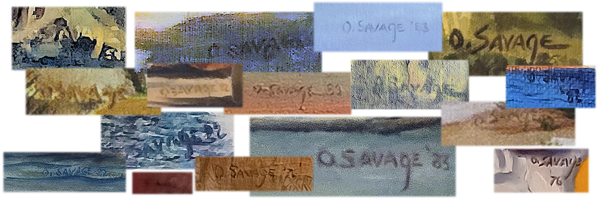
Orville Savage's Art
A family collection of Dad's oil paintings.
A Brief Biography
Orville Loraine Savage (1924-1988) was an American educator, artist, and nurseryman based primarily out of Warren County, Ohio. Known for his dedicated service to public education, his church, and landscaping business, Savage spent the majority of his life in Ohio before retiring to the Gulf Coast of Florida.
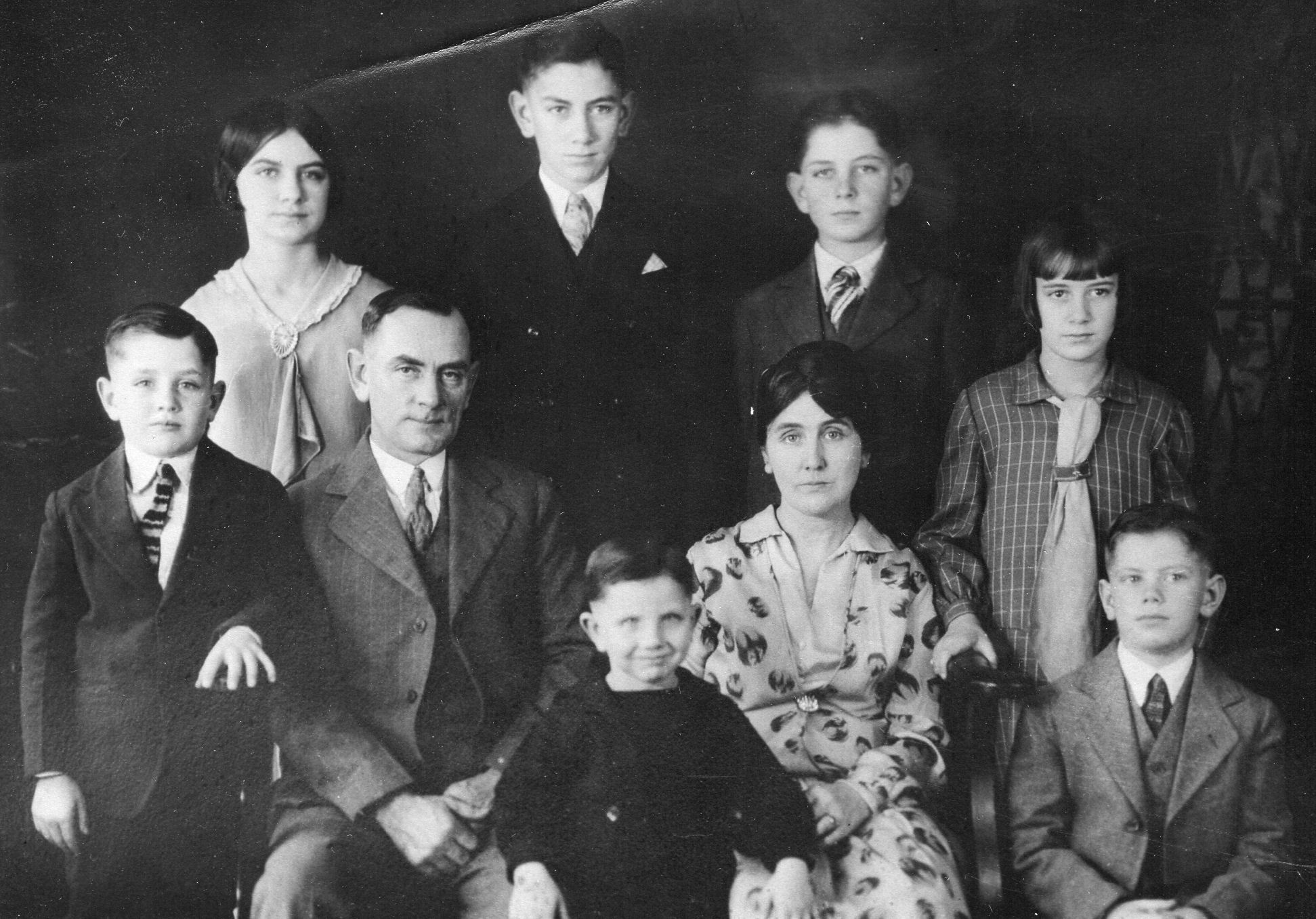
He was born on February 4, 1924, in the unincorporated community of Lytle, Ohio (located within Wayne Township, Warren County). He was the youngest child of Floyd Harrison Savage and Ruth May Dinwiddie. Floyd passed away in 1933 when Orville was nine years old. Ruth was left with a family of five sons and two daughters to raise alone in the depths of the Great Depression. She was unable to provide for them, and the family was scattered. Orville spent four years with a family he never talked about, and was then essentially adopted by Addie and Lester Kendrick, of Ferry, Ohio, when he was 13. He attended Wayne Local Schools in Waynesville, Ohio, graduating in 1942 from Waynesville High School.
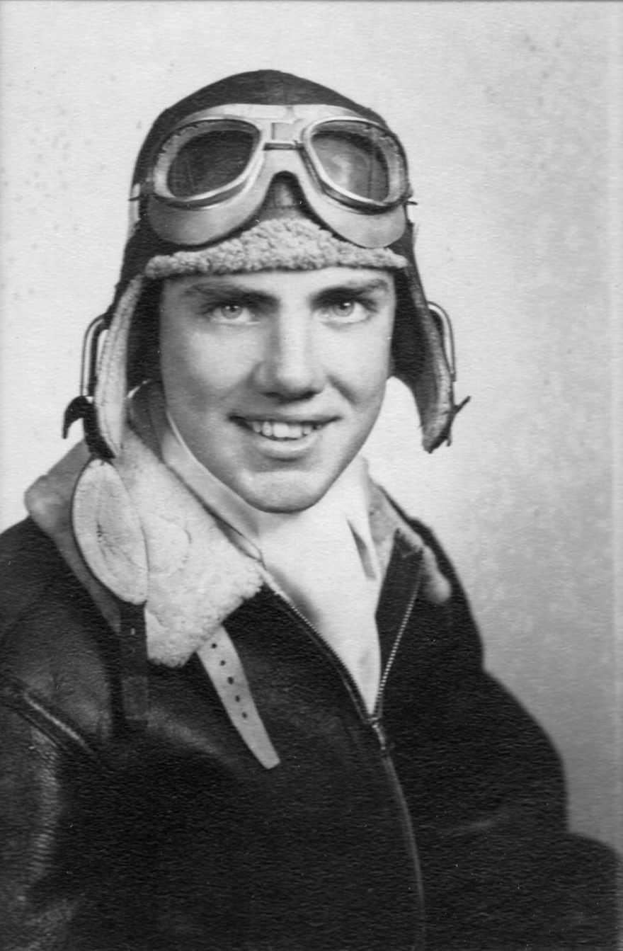
After one semester at Miami University in Oxford, Ohio, he joined the U.S. Army Air Corps in early 1943. He completed Basic Flight Training, and was in Advanced Flight Training when an inner ear problem ended his aspirations to be an Air Corps pilot, and he transferred to armory. He was on a troop ship heading for Tinian when the atomic bombs were dropped on Japan, and arrived shortly before the Japanese surrender. He was mustered out in early 1946.
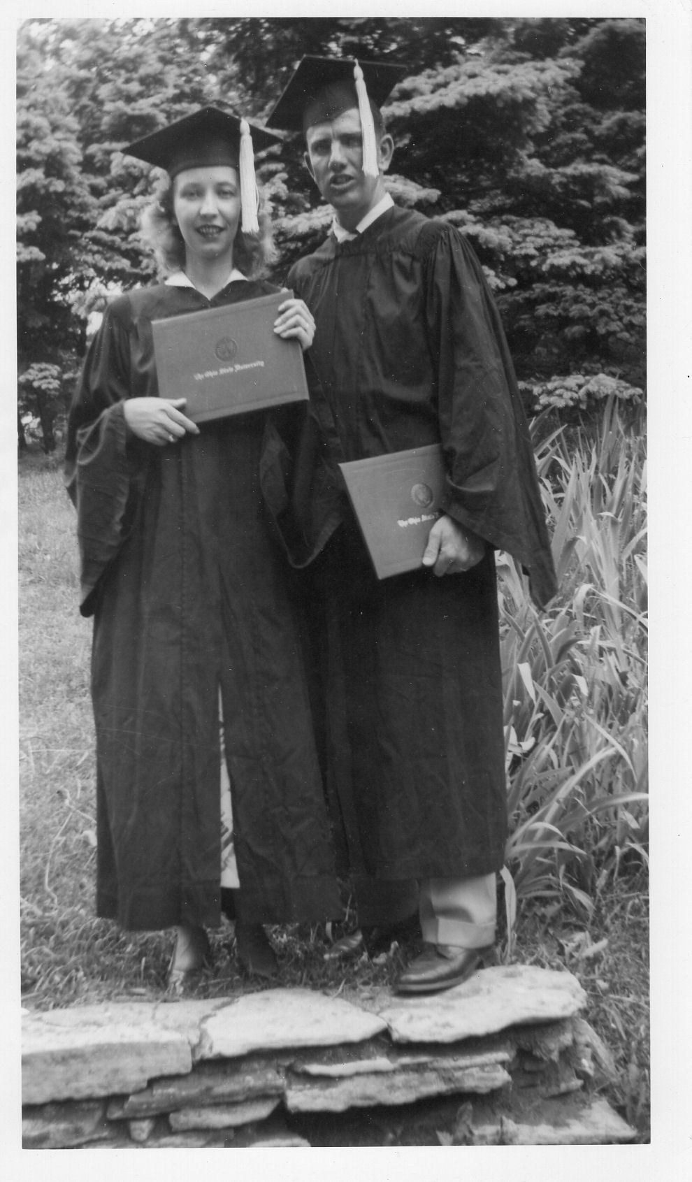
He enrolled at Ohio State University on the GI Bill(1) in the fall of 1946. In 1946, in-state tuition at Ohio State University was $20 per quarter ($60 for the academic year), while room and board at university-operated facilities was around $40 per month(2) . This put the comprehensive cost for a full academic year at roughly $400 to $450 at the time. The GI Bill covered these and other expenses related to education, including books and art supplies, up to $500 per year. At OSU, he met Betty Macomber of Powell, Ohio (south of Delaware), and they were engaged by 1950. Dad and Mom graduated that spring with Bachelor of Science degrees in Education; Dad double majored in Fine Art. They married in August.
After teaching Elementary Art for five years in the Piqua, Ohio school system, Dad accepted a teaching position at Van Buren Jr. High School in Kettering, Ohio. He taught art there until 1974, and occasionally taught adult art classes in night school or out of the family home. When he took the job in Kettering, the family moved back home to the Kendrick Farm, at Ferry, in northwestern Warren County, Ohio. When Addie and Lester retired to Lytle, they gave Dad about three acres on the west side of the farm. Dad and his brother, Everett, built our house there in the summer of 1955. After he retired, Dad began painting again, completing two works in 1976, but by 1978 they decided they'd had enough of the Ohio winters, and they moved to Bradenton, Florida. There, Orville soon picked up his brush and palette knife again and produced numerous oil paintings from slides he'd taken on vacations, and he fished the waters of Sarasota Bay. He passed away at the age of 64 in 1988.
The Post-war OSU Art Scene
Following World War II, the Fine Arts and Education programs at The Ohio State University experienced a period of explosive growth and national prominence, fueled almost entirely by the influx of veterans utilizing the Servicemen's Readjustment Act (the "G.I. Bill" 1944). Orville was part of a historic wave of GIs who transformed higher education, bringing maturity, diverse perspectives, and a strong sense of purpose to the classroom.
The post-war faculty at The Ohio State University transformed the School of Fine and Applied Arts into a hotbed of radical experimentation. Driven by advances in psychology and the pragmatic needs of art education, professors moved away from the traditional, to pioneer immersive, perception-based instruction. The department during the late 1940s and 1950s was characterized by a distinct overlap between active studio practitioners, cognitive theorists, and curriculum reformers:
- Hoyt L. Sherman, Professor of Art & Perception -- Creator of the revolutionary "Flash Lab" technique(3), (4)
- Manuel "Manny" Barkan, Chair of Art Education -- Pioneered interactional, student-centered art curricula(5) , (6)
- Roy Lichtenstein, Student turned Post-War Instructor -- Taught Sherman's unified composition methods before rising to Pop Art fame(7)
- Donald G. Wood, Acting Director & Design Chair -- Standardized modern structural design and studio techniques.(8)
Dad's Evolving Art Style
Dad painted during two distinct periods. The first encompassed his OSU years up through 1954. His works from this period are heavily influenced by his OSU education in the Fine Arts Department; he favored a palette knife and rapid application of layered oils. In his second period, from 1976 through 1984, his mature style, while still influenced by his early work, incorporated less heavily applied paint and used more brushwork. This shift across these two distinct periods beautifully captures both the immediate impact of his post-war training and the subsequent evolution of an artist finding his mature voice. By analyzing his specific changes in tools and material application, we can see exactly how the lessons he learned at Ohio State evolved over a thirty-year trajectory.
His heavy reliance on a palette knife and rapid, layered oils aligned perfectly with the mid-century zeitgeist at OSU. The Palette Knife was seen as a tool for speed. In the post-war era, professors like Hoyt Sherman urged students to abandon meticulous, fussy details in favor of capturing "perceptual unity." A palette knife prevents an artist from getting bogged down in tiny lines. It forces the hand to apply pigment in broad, decisive structural planes. Rapid Application and speed were foundational doctrines in the OSU studios. Working quickly kept the analytical mind from second-guessing the creative impulse. The rapid slashing of wet oil paint onto canvas captured the raw, kinetic energy of the moment. The use of thick, layered oils, often called impasto, treated paint as a tactile, sculptural medium. This physical engagement with the material directly mirrors Manuel Barkan's philosophy that art making is an active, physical interaction with raw matter.
Dad didn't paint from mid 1954, when his daughter was born, until 1976, after he retired. During these years he was kept busy with raising his family, his school teaching and night classes, establishing and running his side gig, "Savage Brothers Nursery" with his older brother Paul, his devotion to the church as a deacon and elder, and to making stained glass windows for the Bellbrook Church of Christ and a dip into silver jewelery making.
When he returned to the canvas decades later, his technical approach shifted toward restraint, control, and a lighter touch. He relied more on brushwork; moving from the semi-rigid steel of a palette knife to the pliable bristles of a brush allows for infinitely more nuance, softer transitions, and varied textures. It indicates a shift from aggressive, physical energy to intentional, rhythmic mark-making. He tended to apply less paint -- a thinner application of paint allows the underlayers or even the grain of the canvas to breathe. This lighter touch suggests that by 1976, he no longer needed the sheer volume of thick paint to establish a composition; he could achieve structural balance through precise placement and color relationships. However, even though his application became lighter, his early training was still be visible in how he organized the canvas. The rapid, intuitive sense of composition he developed in the late 1940s would remain the underlying structural skeleton of his later paintings, even when rendered with softer brushwork. But he still like to use a palette knife, too.
The Catalog of Paintings
Below, I present many of the paintings he made, in the two periods of his work. It is not always easy to sort out the exact order because some of the paintings are signed but not dated, especially the ones from his OSU period. And during the three years from 1982 through 1984 he turned out a large body of work. By 1985, however, he was beginning to feel the effects of the cancer that took his life in 1988, and he made no more art. But we still have his paintings, so he has never really left us.
The Early Period (1946-1954)
Dad's early artwork was characterized by a distinct American Regionalist(9) style that focused heavily on capturing mid-century Ohio architecture, local infrastructure, and natural Midwestern landscapes. As both a fine artist and a career public educator, his creative portfolio was deeply intertwined with the community life of southwestern Ohio. He primarily painted with oil on canvas. He favored a classical, structured approach to composition, relying on the rigorous studio fundamentals he mastered during his time at Ohio State University.
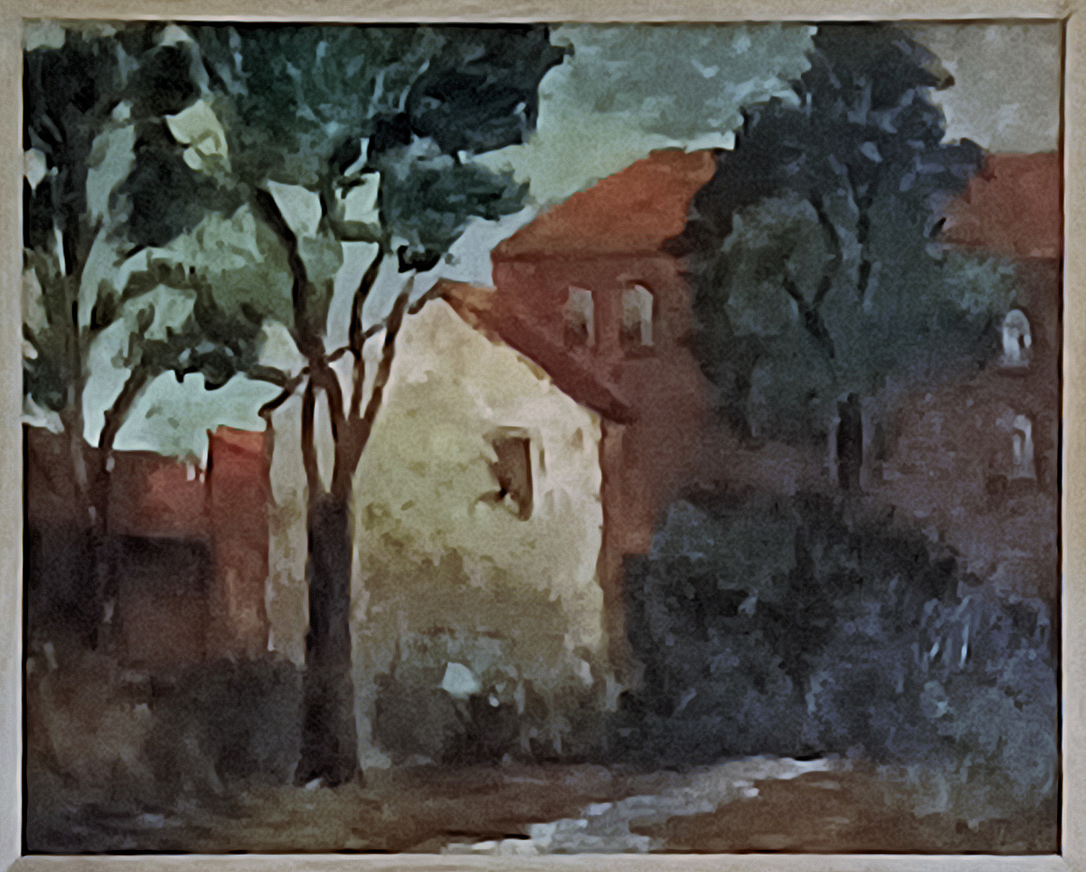
Dormitory at Ohio State University
Catalog Information
Title: Dormitory at Ohio State University
Date: c. 1946
Medium: Oil on canvas
Dimensions: Approximately 24 x 30 inches
Signature: Signed lower right (integrated into composition)
Credit Line: Collection of the Artist's Family
Style, Technique, and Compositional Analysis
The composition balances an organic framework with solid geometric forms. The architecture -- characterized by red masonry and a prominent, cream-colored gable spotlighted by sunlight-is compressed into a shallow visual plane. This structure recalls Cézannian Post-Impressionism(10) , where buildings are stripped down to their essential geometric masses.
The application of medium shifts intentionally between expressive, directional brushwork in the trees and blocks of thick palette knife strokes on the architectural façades. This duality builds a rich textural depth. Rather than prioritizing documentary realism, he subdues fine details-such as window panes or roof shingles-to emphasize the spatial interplay of light, form, and shadow. His choice of a muted, earthy color palette populated by deep forest greens, warm ochres, and brick reds reflects the dominant tonal preferences of mid-century American scene painting. His deliberate choice to soften individual details in favor of structural unity aligns perfectly with the foundational OSU School of Fine Art philosophy of the post-war period.
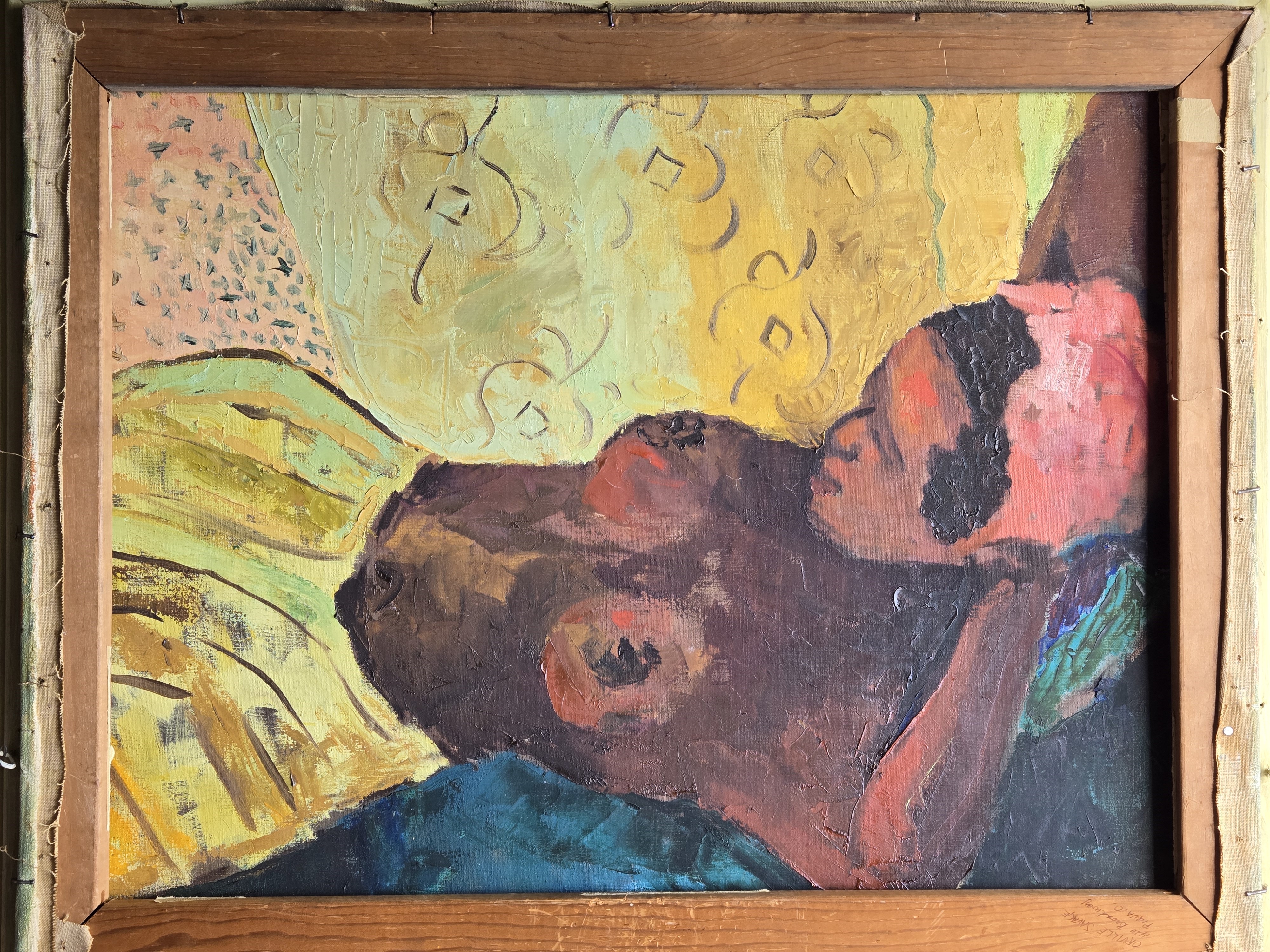
Reclining Nude
Catalog Information
Title: Reclining Nude
Date: c. 1947
Medium: Oil on canvas
Dimensions: Approximately 24 x 30 inches
Signature: Unsigned
Credit Line: Collection of the Artist's Family
Style, Technique, and Compositional Analysis
An exceptional, newly discovered double-sided canvas verso depicting a stylized, reclining nude figure. This intimate studio work captures the material realities of the post-war studio movement, where veteran student-artists working under the G.I. Bill frequently repurposed canvases for experimental, academic exercises. This intimate study of a reclining figure showcases a masterful blend of mid-century modern sensibility and post-impressionist inspiration. Strikingly reminiscent of Paul Gauguin's Tahitian portraits, the work relies on a bold color palette of saturated yellows, rich ochres, and deep structural blues to define form rather than traditional, realistic shading.
The artwork utilizes a tight, intimate framing that emphasizes the physical presence of the subject. By positioning the reclining nude diagonally across the canvas, he creates a dynamic flow that carries the viewer's eye from the bottom-left drapery up to the subject's resting head. This structure mirrors classical odalisque poses but strips away traditional depth, pushing the subject forward into the immediate foreground.
The connection to Paul Gauguin and Post-Impressionism(11) is evident in the flattening of the pictorial space and the rhythmic, decorative background patterns. Rather than using academic chiaroscuro to model three-dimensional form, he separates planes using shifts in color temperature-juxtaposing the warm, earthy tones of the skin against the vivid yellows and deep blues of the surrounding textiles.
The dual use of brush and palette knife highlights a rigorous engagement with materials.
- Palette Knife Work: The thick, impasto applications build tangible physical volume on the skin and the golden skirt, giving the painting a sculpted quality.
- Brushwork: Finer brushwork is reserved for the rhythmic squiggles and patterns in the background, showing a deliberate contrast between heavy texture and graphic line work.
Educational Context
Graduating from Ohio State University with a dual major in Art and Education meant mastering both the technical execution of art and the theory behind its history. During the mid-20th century, top-tier university art programs actively pushed students to experiment with Modernist philosophies. Creating a "double-sided canvas" was a common, resourceful practice among art students managing coursework demands, demonstrating a prolific period of creative output where older ideas literally became the structural backing for new assignments.
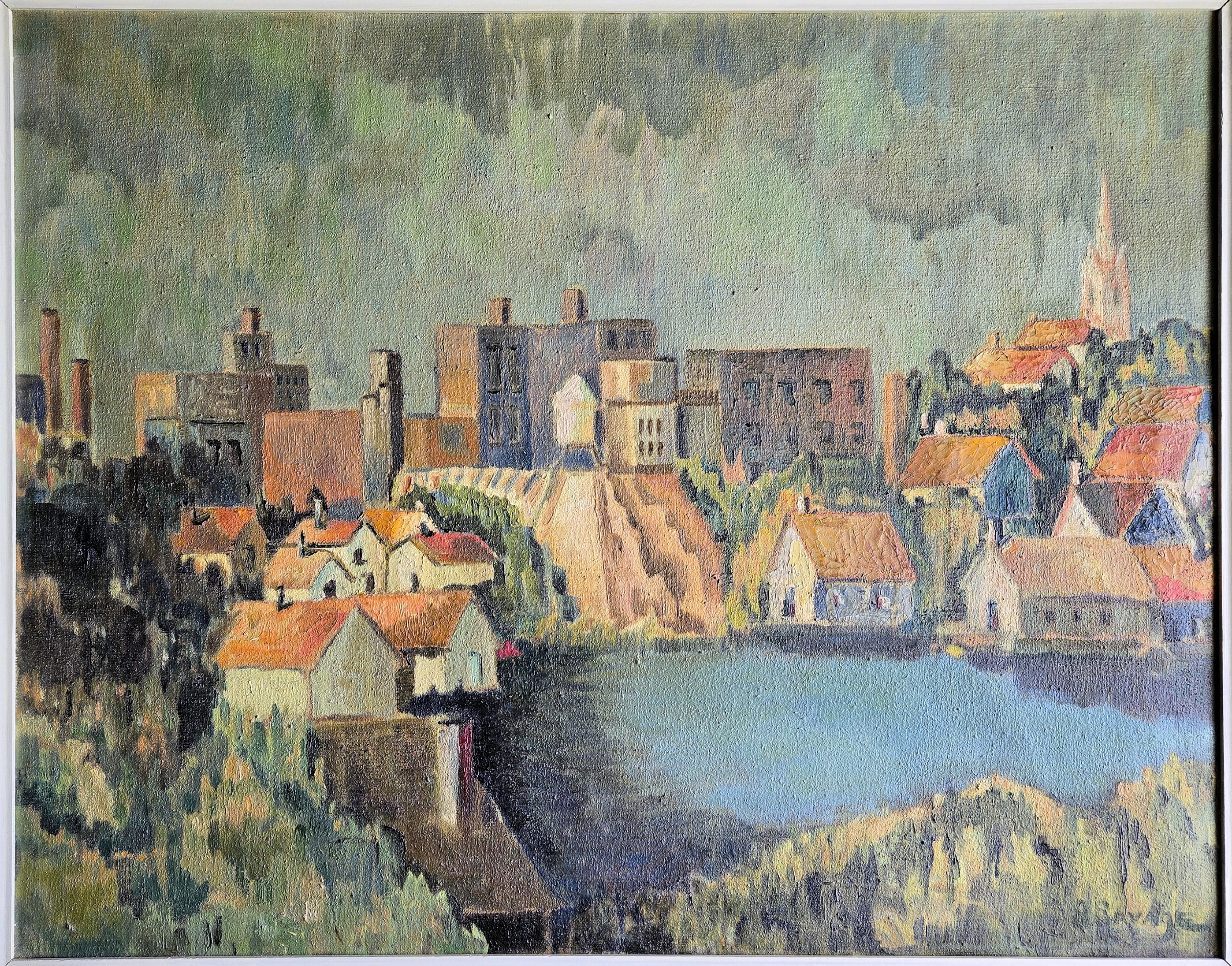
Zanesville Landscape, Muskingum River Valley
Catalog Information
Title: Zanesville Landscape, Muskingum River Valley
Date: c. 1947
Medium: Oil on canvas (reverse side of Reclining Nude)
Dimensions: Approximately 24 x 30 inches
Signature: Signed in lower right
Credit Line: Collection of the Artist's Family
Geographic Clues Pointing to Zanesville
- The Dramatic Topography & Water Frontage: Zanesville is famous for its steep, rolling hillsides that drop sharply down to the waterfront at the confluence of the Muskingum River and the Licking River. The houses built tiered on the hillside match this local terrain perfectly.
- The Tall Industrial Chimneys: The tall smokestacks on the left flank of the town represent the historic, bustling manufacturing sector of the city. In the 1940s, Zanesville was globally recognized as the "Pottery Capital of the World," packed with heavy clay, pottery, and glass manufacturing plants right along the riverbanks.
- The Prominent Church Spire: On the upper right hillside, the tall, sharp church steeple rising above the residential rooftops strongly mirrors local historic skyline anchors, such as the spire of St. Thomas Aquinas or St. Nicholas Catholic Church.
- The Central Downtown Core: The blocky, mid-rise brick commercial structures sitting on the bluff just behind the riverfront houses align with Zanesville's historical downtown commercial district.
Style and Compositional Analysis
A commanding and historically significant mid-century industrial landscape depicting the city of Zanesville, Ohio, during its post-war manufacturing peak. Executed on the reverse side of Reclining Nude during his studies at the Ohio State University School of Fine Arts, the composition beautifully documents the unique, rugged topography of the Muskingum River Valley. He positions a cluster of blocky, masonry factory complexes and towering industrial smokestacks against the steep, dramatic river bluffs, while historic gothic-style church spires crest the residential hillsides in the upper right quadrant.
The work acts as a synthesis of European Post-Impressionism and American Regionalism. Dad utilized a dense, rhythmic impasto technique, applying paint in thick, broken brushstrokes that emphasize modern geometric structure over literal realism. The canvas features a sophisticated interplay of temperature and light: deep, cool lavenders and blues anchor the reflecting riverfront foreground, giving way to warm, sunlit ochres and soft oranges that illuminate the mid-ground industrial core. True to Dad's characteristic habit of integrating his monograms directly into the organic rhythms of his environments, the work features an embedded signature tucked into the lower right corner.
Technical Analysis of the Painting
- Structural Geometric Subtext (Under-Drawing and Form): While the texture gives the painting an organic, fluid quality, the underlying composition is deeply rooted in strong geometric abstraction. The houses are simplified into clean, blocky, cubist-adjacent prisms and rectangles. This tension between loose paint application and rigorous architectural form demonstrates formal academic training. It shows an artist intentionally "building" a landscape rather than just copying it.
- Impasto and Broken Color Techniques: Dad used a heavy impasto technique, building a dense, tactile surface texture across the linen or canvas weave. Instead of smooth, blended transitions, he applied paint in distinct, rhythmic strokes that catch the light individually. He relied heavily on broken color--placing unexpected hues side-by-side (such as soft pinks and oranges in the terrain, and cool lavenders against the blues of the water). Viewed from a distance, these colors optically merge to create a vibrant, atmospheric hum typical of seasoned colorists.
- Atmospheric Perspective and Value Control: The painting is divided into distinct value fields that guide the viewer's eye. The Foreground & Water are dominated by deep, saturated shadows and a highly reflective cool blue, grounding the lower third of the canvas. The houses and factories in the midground step forward brightly, catching a warm, low midday sun. The massive hillside in the background dissolves into hazy greens and muted ochres, utilizing classic atmospheric perspective to create depth despite the dense wall of buildings.
American Regionalism and the "Industrial Landscape"
The choice to paint Zanesville's unique intersection of natural river bluffs and brick industrial factories connects directly to American Regionalism. In the 1930s and 40s, Midwestern artists rejected elite European abstraction to document the grit, labor, and unique character of their home territories. His choice to celebrate the factories, smokestacks, and steep-hilled working-class neighborhoods of Zanesville aligns him with this proud, deeply American tradition.
French Post-Impressionism and Cézanne
The structural fragmentation of the hillsides and houses heavily mirrors the influence of Paul Cézanne. Post-war art education heavily emphasized Cézanne's philosophy of treating nature through the cylinder, the sphere, and the cone. By grouping the homes into interlocking geometric blocks climbing the hillside, Dad adapted European Post-Impressionism to interpret the rugged geography of the Muskingum River Valley.
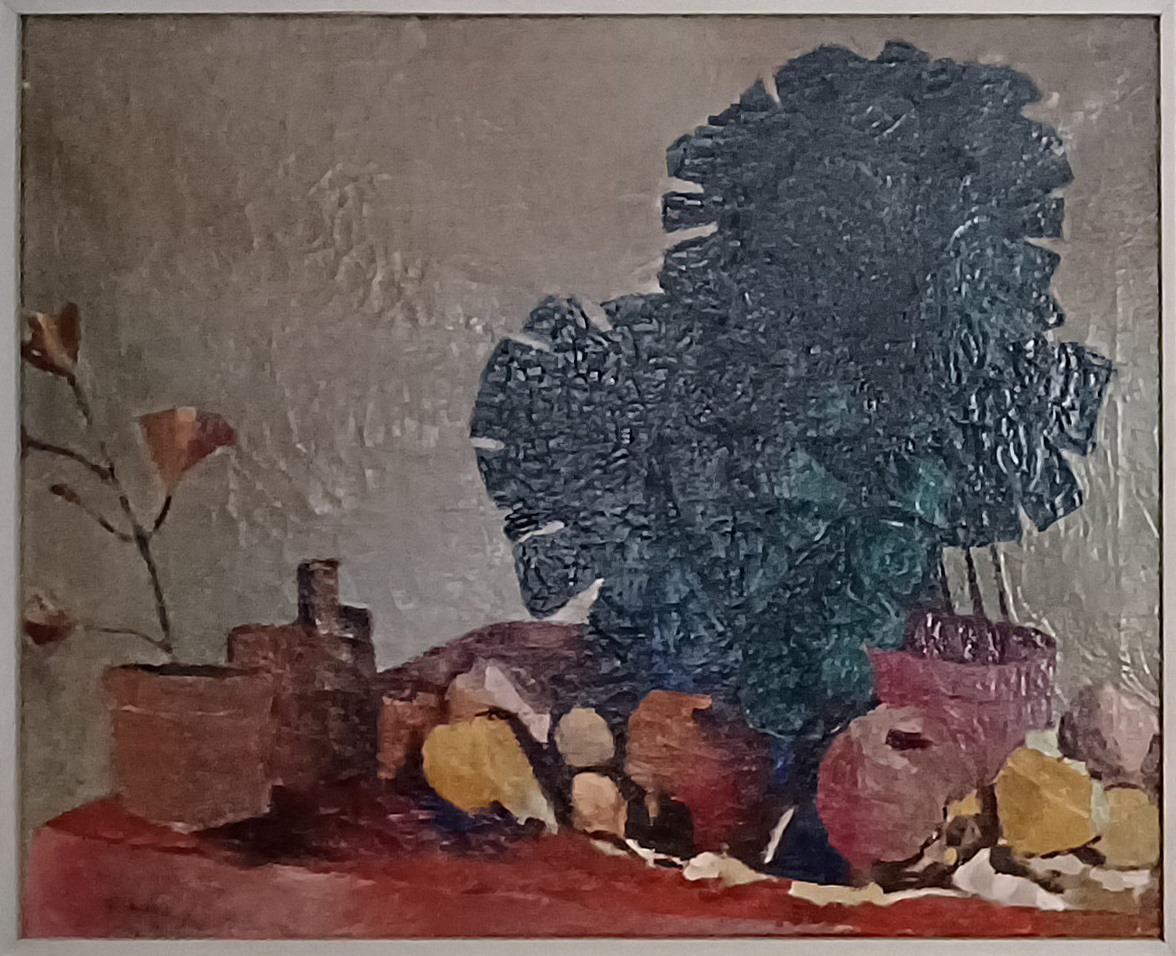
Still Life with Foliage and Fruit
Catalog Information
Title: Still Life with Foliage and Fruit
Date: c. 1949
Medium: Oil on canvas
Dimensions: Approximately 26 x 32 inches
Signature: Signed lower left (integrated into composition)
Credit Line: Collection of the Artist's Family
This fourth work from Dad's college portfolio is an ambitious, large-scale still life that demonstrates a profound shift toward Structural Cubism and Abstraction. At 26 x 32 inches, this is a substantial canvas, likely created as a major advanced studio piece or thesis project at Ohio State University.
Style, Technique, and Compositional Analysis
A major, large-scale mid-century modernist still life executed entirely with a palette knife during the his advanced studies at the Ohio State University. The monumental composition features a dense, tabletop arrangement of terra-cotta planters, fruit, bottles, and scattered organic forms resting upon a rich crimson surface, all dominated by a towering, deeply saturated blue-green abstracted plant form.
This canvas marks a sophisticated leap into Analytical Cubism and mid-century formal abstraction. Heavily influenced by the mechanized forms of Fernand Léger, he rejected traditional botanical rendering, instead fracturing the central foliage into a dense mosaic of interlocking geometric shards and rigid facets. The background is treated as a uniform, heavily textured field of neutral grey-beige, systematically flattening the pictorial plane and pushing the heavily modeled still life elements to the absolute foreground.
Technically, the work stands as a tour-de-force of palette knife manipulation. Dad used a rigorous "bricking" technique to build the shimmering, tactile surface of the central leaves, contrasting it against the broad, dragged strokes that sculpt the architectural weights of the pottery and fruit below. Fine sgraffito incisions scratch through the upper paint layers to provide a sharp linear subtext. True to his signature methodology, the work features a concealed, embedded signature integrated into the lower left corner within the shadows of the tabletop.
- The Mosaic Pattern: Look at the massive blue-green foliage. It is built out of hundreds of small, uniform, rectangular dabs of the knife. This "bricking" technique creates a dense mosaic texture that vibrates with internal light.
- Sculpting the Foreground: The terra-cotta pots, bottles, and scattered fruit along the red tabletop are applied with long, directional, sweeping scrapes of the blade, giving them a hard, chiseled, architectural presence.
- Sgraffito (Scraping Into Paint): In the background and around the edges of the central plant, you can see fine lines where he used the sharp tip or edge of the knife to scratch directly into the wet paint layer. This reveals the under-colors and creates a nervous, energetic linear drawing right inside the physical texture.
Radical Flatness and Negative Space
Notice how the background is treated. Rather than creating a realistic wall or a sense of deep room space, Dad filled the background with a uniform, shimmering field of neutral, metallic grey-beige. By matching the heavy texture of the background to the texture of the foreground objects, he deliberately compressed the depth of the painting. This pushes the entire still life arrangement right up to the surface of the canvas--a core tenet of mid-century abstract painting taught at OSU, which emphasized the canvas as a flat, two-dimensional plane rather than a trick window.
An inside joke?
The back right corner of the table is missing; where it should be, Dad just has more of the background. The painting always hung over our kitchen table, and once, while we were having dinner I pointed that out to Dad. He just kind of chuckled at my realization. His chuckle suggests he knew exactly what he was doing, and it highlights a beautiful moment where he was playfully embracing--or perhaps slightly poking fun at--the radical theories being pushed by his professors at Ohio State University. There are two fascinating ways to look at that "missing" back right corner of the table in the context of late 1940s art school:
- The "Mistake" That Became a Modernist Victory -- In traditional academic painting, fixing a perspective mistake is easy: you just paint the missing corner back in. However, in the post-war era, OSU professors like Hoyt Sherman heavily preached that a painting should be an uninterrupted record of pure visual force. If Dad was working with a palette knife at lightning speed--focusing entirely on the massive, heavy weight of that blue-green plant--he may have simply run out of room or accidentally blocked out the corner with that shimmering grey background. In the mid-century modern art world, going back to "fix" it with a tidy little perspective line would have been seen as dishonest, turning a powerful modern abstract design back into a boring, literal illustration. By leaving it out, the background aggressively bleeds forward, which accidentally achieved the exact "radical flatness" his professors were grading him on!
- A Deliberate Cubist Gag -- Given that Dad loved hiding his signatures, it is highly likely that omitting that corner was a deliberate, witty choice. One of the core rules of Cubism is the destruction of Renaissance perspective. Masters like Picasso and Braque famously painted tables that tilted forward at impossible angles, or dropped corners entirely, to prove that a painting is just a flat canvas, not a real table in a real room. So her may have deliberately skipped painting that back corner to see if his professors would praise it as a brilliant cubist manipulation of space. The fact that he chuckled about it suggests it was his own private, painterly inside joke--a moment where he mastered the modern art "rules" so thoroughly that he could play with them. I prefer this explanation. Near the end of his life he told me that he never thought much of art critics anyway.
However, maybe he was chuckling about me being so dull-witted. As in, "It's been hanging on the wall there for more than ten years, and you're just now noticing that? A bit slow on the uptake, aren't you, boy?" And this is probably closer to the truth.
Big Four Railway Bridge Sidney, Ohio
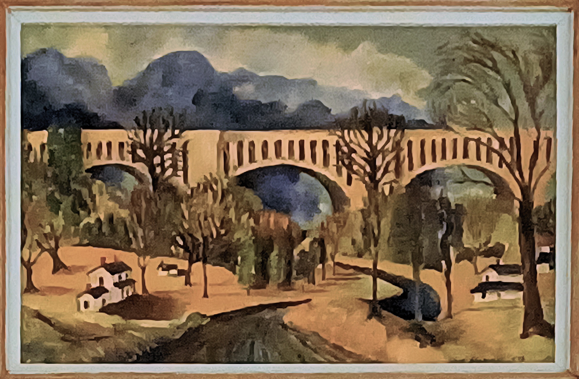
Catalog Information
Title: Big Four Railway Bridge Sidney, Ohio
Date: c. 1954
Medium: Oil on canvas
Dimensions: Approximately 16 x 23 inches
Signature: Signed and dated lower right
Credit Line: Collection of the Artist's Family
Painted in 1954, this striking oil landscape captures the monumental presence of the historic Big Four Railway Bridge in Sidney, Ohio. The painting synthesizes structural geometry with mid-century American Regionalism. The composition utilizes a rhythmic series of concrete arches that stretch boldly across the valley, framed by dense, sculptural clouds and stylized foliage. Employing a sophisticated blend of palette knife applications and expressive brushwork, Dad achieved a rich textural surface that emphasizes the structural weight of the bridge against the organic soft curves of the valley and rural homes below.
Style, Technique, and Compositional Analysis
Here, Dad sets up a brilliant tension between industrial modernism and rural tranquility. The monumental concrete arches of the Big Four Bridge span the entire upper-middle registry of the canvas, acting as a rhythmic architectural anchor. To balance this heavy geometry, he utilizes a winding, dark S-curve path or riverbed in the foreground. This curve leads the viewer's eye through the soft valley, past quaint domestic cottages and organic tree lines, up toward the engineering marvel. This masterful layering reveals his deep grounding in foundational visual design and art education.
He avoids mere photographic realism, opting instead for a stylized, semi-abstract interpretation of the landscape. The clouds are rendered as heavy, undulating geometric volumes, echoing the rhythm of the bridge below. The trees are treated as architectural masses of color rather than individualized leaves, showcasing a sophisticated post-war approach to simplifying nature into pure form and space.
The dual implementation of palette knife and brushwork speaks directly to his formal fine art training.
- The Palette Knife allowed him to apply thick, impasto blocks of paint to the concrete structure of the bridge and the surfaces of the cottages. This gives the industrial elements a tangible, structural weight and flat planarity reminiscent of mid-century painting trends.
- The Brushwork introduces fluid, rhythmic motion. He uses looser, expressive brushstrokes in the foliage and the dark, churning skies to contrast against the rigid knife work, creating a vibrant surface texture that catches the light differently across the canvas.
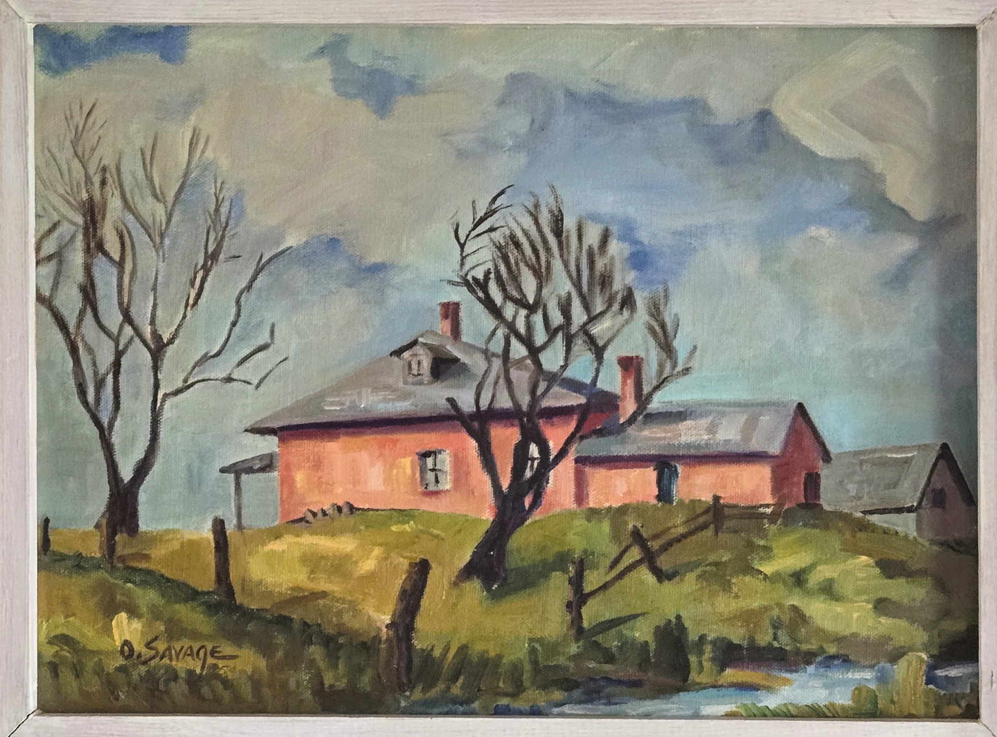
Koerner House on Clyo Road at Ferry, Ohio
Catalog Information
Title: Koerner House on Clyo Road at Ferry, Ohio
Date:1954
Medium: Oil on canvas
Dimensions: Approximately 12 x 16 inches
Signature: Signed and dated lower left
Credit Line: Collection of the Artist's Family
A mid-century landscape depicting a homestead in rural Ohio under a dramatic, swirling autumn or winter sky that shares technical similarities with the Big Four Railway Bridge Sidney, Ohio work from the same year. Painted four years after the Dad completed his studies at Ohio State University, this piece comes from the final year of his early period. It balances texture and tool, utilizing a dynamic mixture of visible brushwork and palette knife applications to build the physical terrain of the hillside. The architecture of the coral-pink farmhouse provides a warm, structural anchor to the composition, starkly contrasted by the expressive, organic curves of bare, dark trees and a weathered wooden fence line.
Artistic Style and Influences Analysis
The Koerner Farmhouse on Clyo Road at Ferry, Ohio beautifully captures a transitional moment in American mid-century art, reflecting the robust fine art education offered at Ohio State University (OSU) during the post-WWII GI Bill era. It exhibits a synthesis of Mid-century American Regionalism and Post-Impressionalist Modernism.
Mid-century American Regionalism influences: The choice of a local, rural Ohio landscape follows the tradition of Midwestern Regionalists who found dignity and poetic isolation in everyday agricultural structures. The farmhouse is not romanticized but presented as a sturdy, enduring element of the local environment.
- Localized, rural Midwestern subject
- Earthy ochres, muted greens & pinks
- Grounded, structural composition
Post-Impresionist Modernism, Post-Impressionist and Expressionist Techniques: Rather than relying on strict realism, Dad incorporated expressive structural choices. The heavy, dark outlines framing the farmhouse architecture and tracing the stark, bare branches reveal an engagement with Post-Impressionist form.
- Heavy, dark structural outlines
- Dynamic palette knife impasto texture
- Expressive, windswept bare trees
Form, Color, and Technique
The Palette Knife and Brushstrokes: The painting showcases a sophisticated handling of texture. By combining directional brushstrokes in the sky with heavier palette knife applications on the earth, Dad achieved a tactile impasto effect. This technique gives the rolling hillside physical weight and contrasts it against the fluid, churning motion of the overcast sky.
Color Theory: The color strategy is exceptionally deliberate. The earthy ochres and deep greens of the hill anchor the bottom of the frame, while the warm, muted pink-coral of the farmhouse acts as a brilliant complementary focal point against the cool blues, grays, and whites of the sweeping sky.
The Composition: The placement of the gnarled, leafless trees frames the farmhouse, directing the viewer's eye up the slope. The broken wooden fence posts create a rhythmic diagonal movement that pulls the eye across the terrain, giving a relatively small 12 x 16-inch canvas an expansive, monumental presence.
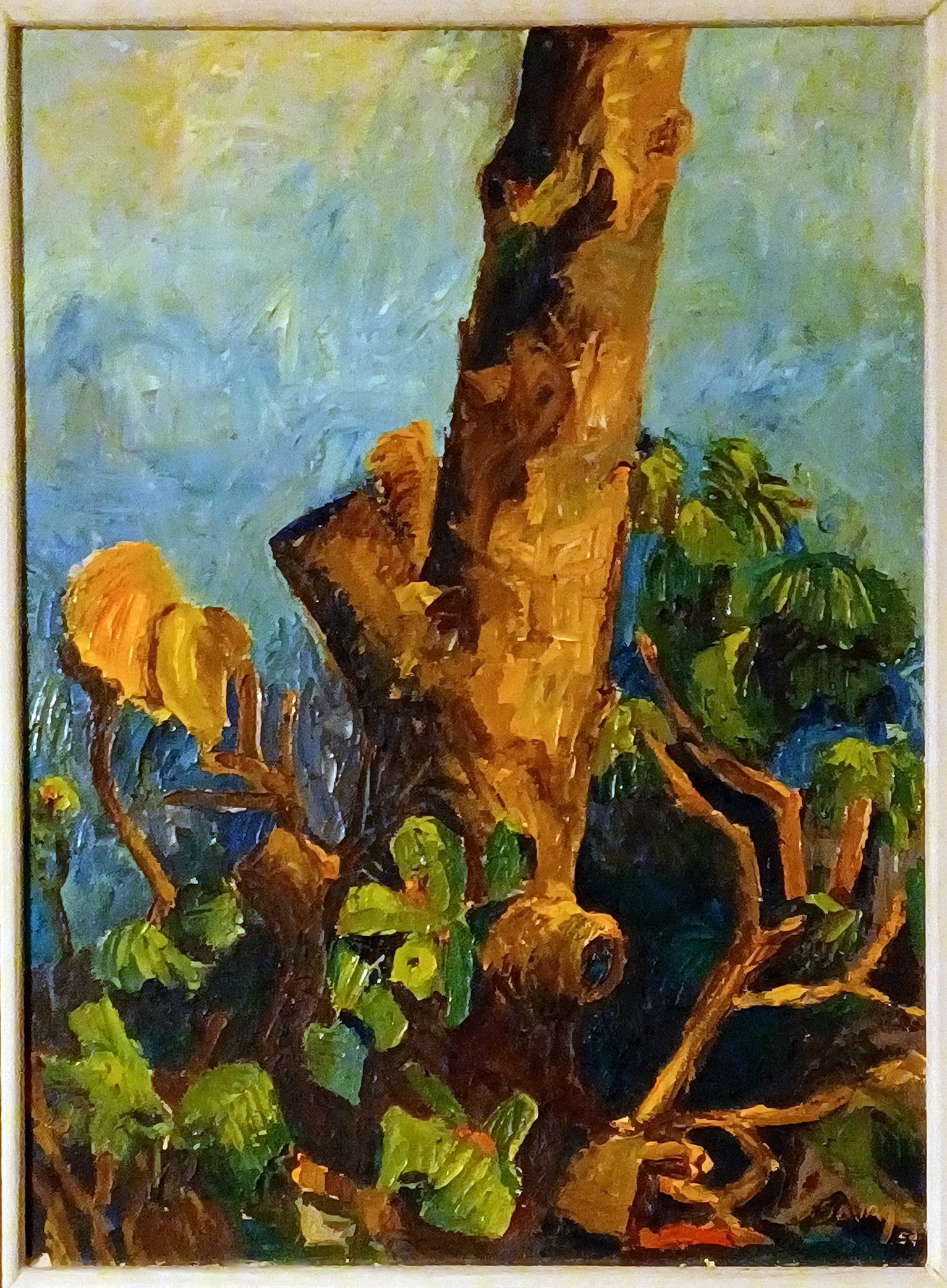
The Tree Trunk
Catalog Information
Title: The Tree Trunk
Date: 1954
Medium: Oil on canvas
Dimensions: Approximately 22 x 28 inches
Signature: Signed and dated lower right
Credit Line: Collection of the Artist's Family
This work is the last extant painting (and, in my opinion, the best) from Dad's early period. "The Tree Trunk" is a remarkable example of mid-century American Expressionism, showcasing a powerful physical texture that perfectly mirrors the ruggedness of its subject. He painted it exclusively with a palette knife, which makes it a stellar representation of impasto technique. By applying thick, unthinned oil paint directly to the canvas with the flat edge and tip of the knife, he achieved a sculptural quality that gives the tree bark an authentic, tactile dimension.
Style and Influences
- Expressionist Texture: The painting strongly aligns with Post-Impressionism and early mid-century Expressionism, prioritizing emotional texture and form over precise realism.
- Abstracting Nature: By isolating a lone trunk, the composition strips away traditional landscape horizons, leaning toward the mid-century American trend of abstracting organic forms.
- Vibrant Color Palette: The dramatic contrast between the warm, earthen ochres of the bark and the deep, electric blues and greens of the background suggests the influence of European Fauvism and early 20th-century German Expressionism.
- Mid-Century Modernism: The focus on an isolated, powerful form from nature reflects post-WWII existential and modernist art movements, which sought meaning in raw, individual subjects.
Compositional Influences
Based on the structural, non-traditional framing of The Tree Trunk, its aggressive palette knife execution, and Dad's academic training in a mid-1950s university studio, this work draws from a blend of late-19th-century pioneers, European avant-garde movements, and prominent local faculty at Ohio State University in the Post-War era:
- Paul Cézanne: The choice to zoom in tightly on a single, massive tree trunk--using it as a geometric anchor that fragments the background--strongly echoes Cézanne's structural landscapes. Cézanne famously abandoned traditional atmospheric perspective to treat nature through "the cylinder, the sphere, and the cone," a philosophy directly visible in the solid, architectural weight of this trunk.
- The Group of Seven (Tom Thomson and Lawren Harris)(12) : Mid-century North American landscape artists frequently looked to Canadian modernists. The Group of Seven often isolated a solitary, weather-beaten tree against dramatic sky and foliage backgrounds to symbolize resilience, closely mirroring the monumental, lone positioning of Savage's subject.
- Chaim Soutine(13) : Unlike classical landscapes that frame nature from a comfortable distance, Expressionists like Soutine utilized compressed, claustrophobic spacing. Dad brought the tree trunk so far forward into the viewer's immediate space that it stops being a passive object and becomes an aggressive, psychological presence.
Technique
- Exclusive Palette Knife Work: The application relies entirely on a palette knife rather than brushes, producing sharp, structural planes of color instead of blended gradients.
- Impasto Layering: Heavy, thick applications of oil paint create a sculptural, three-dimensional surface texture that catches physical light within the room.
- Concealed Signature: The artist deliberately integrated his signature into the lower right corner, camouflaging it among the jagged, dark strokes of the lower branches and shadows to avoid disrupting the visual rhythm of the painting.
- Broken Color Boundaries: The knife strokes allow distinct colors to sit directly adjacent to or layered abruptly over one another, forcing the viewer's eye to optically mix the varied tones of the trunk and leaves.
Technical Influences
- Maurice de Vlaminck and the Fauves: The choice to bypass brushes entirely and rely on raw, juxtaposed patches of thick color directly references the Fauve movement. Artists like Vlaminck and André Derain applied pure paint straight from the tube or with broad knives to break away from traditional academic blending.
- Vincent van Gogh: While Van Gogh used heavy brushes, his invention of impasto--leaving thick, physical ridges of wet paint on the canvas to trap natural room shadows--paved the way for the palette knife techniques used here. Dad used the knife to replicate Van Gogh's frantic, directional energy, treating the bark as a swirling tapestry of physical texture.
- Hans Hofmann(14) : By 1954, Hofmann's "push and pull" theory of color was the dominant technical gospel in American university art departments. The concept dictated that spatial depth should be created entirely through the interaction of warm colors (which advance) and cool colors (which recede). Dad executed this by "pushing" the warm, bright ochres of the tree forward against the "pulling" deep blues of the background.
The Lost Works
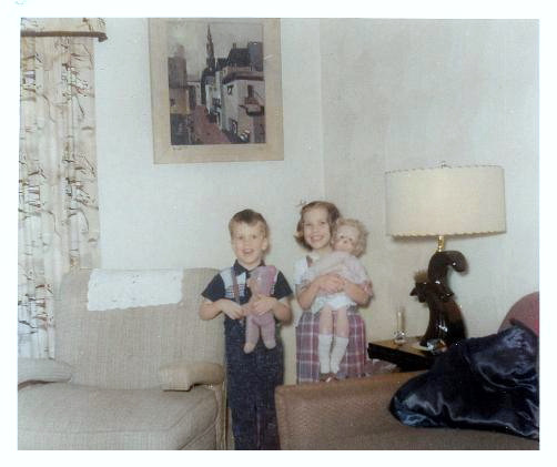
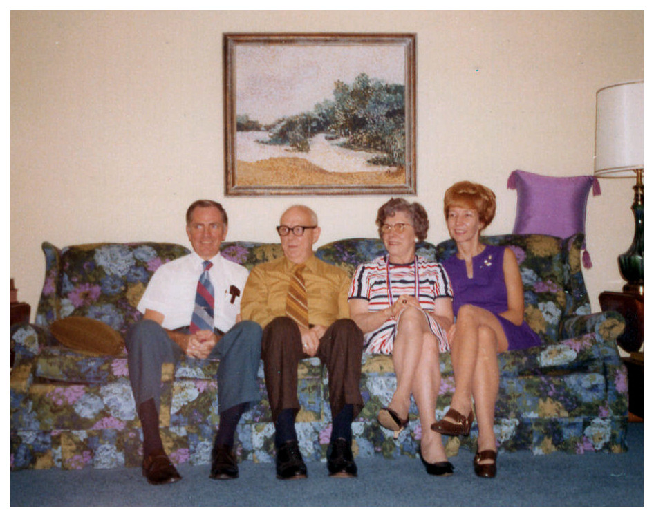
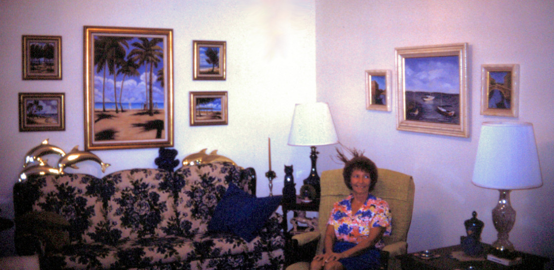
Some of Dad's paintings were destroyed by a basement flood in the 1960s. One of them was displayed on the wall at home when I was very young; one was in Mom and Dad's bedroom early on, but when Mom re-decorated my old bedroom she hung it there in late 1976. Another hung over the living room sofa when I was a teenager, and appears in many typical "Couch" pictures. These last two were with Mom when she lived in Tennessee in the 2000s, but seem to have been lost when she moved to the east coast of Florida soon before she passed away in 2013. So I include them here, but the images are of poor resolution because they've been cropped out of snapshots.
Columbus Street Scene
Catalog Information
Title: Columbus Street Scene
Date: c. 1949
Medium: Oil on canvas
Dimensions: Approximately 22 x 28 inches
Signature: Signed and dated lower right
Credit Line: Known only from photographs--destroyed in a basement flood.
This mid-century urban landscape represents a deeply personal piece of American regional modernism, tying together the academic environment of post-WWII Ohio and the evolving trends in mid-century American art. The painting depicts a narrow, rising street flanked by multi-story commercial or residential buildings, culminating in a prominent, slender church steeple against a pale sky. It is likely, given Dad's enrollment at OSU in Columbus during the late 1940s, the composition strongly hints at two highly probable Ohio locations:
- The Near Northside / Short North (Columbus, OH): This historic district sits directly between the OSU campus and downtown Columbus. It featured dense rows of 19th-century brick commercial buildings interspersed with prominent historic churches, similar to the architecture captured here.
- Downtown Columbus (Looking toward historic steeples): The deep perspective and dense clustering of buildings closely mirror the urban corridors of Columbus during the late 1940s, where older neighborhoods were frequently documented by art students working in the open air.
Style, Influences, and Technique
The painting sits firmly at the intersection of American Realism and early Precisionism. Rather than rendering a photographic copy of the street, the artist abstracted the scene into strong geometric blocks, emphasizing the heavy verticality of the urban environment and the dramatic receding line of the road.
Art Historical Influences:
- The Ashcan School & American Scene Painting(15) : The choice of a gritty, everyday urban street corner reflects the influence of the Ashcan School and Regionalism, which celebrated the beauty of commonplace American environments.
- Charles Burchfield & Edward Hopper(16), (17) : The stark mood, isolated structures, and dramatic architectural forms echo the melancholic streetscapes of Edward Hopper and the early, architectural watercolors of Ohio-born artist Charles Burchfield.
- The Academic Impact: Training in Fine Art and Education simultaneously in the late 1940s meant exposure to a transitional curriculum where traditional representational art was being influenced by post-cubist abstraction.
Technical Execution
- Medium and Support: Oil on canvas, roughly 24 x 30 inches--a classic mid-to-large exhibition size favored by university students for studio critique submissions.
- Brushwork and Application: The work utilizes thick, visible, expressionistic brushstrokes to build form. The paint application feels heavy and structural, giving the buildings a physical, weathered weight.
- Color Palette: The palette is intentionally muted, dominated by industrial grays, whites, and earthy ochres, contrasted against the warm brick-red tones of the ascending street. This reflects the atmospheric haze common to industrial Midwestern cities of the era.
Impressionist Landscape
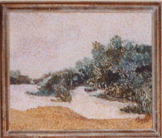
Catalog Information
Title: Impressionist Landscape
Date: c. 1948-1950
Medium: Oil on canvas
Dimensions: Approximately 24 x 30 inches
Signature: Signed and dated lower right
Credit Line: Known only from photographs--lost around 2012.
This impressionistic landscape features short, visible brushstrokes and a muted color palette to capture light and atmosphere.
Style and Technique Analysis
- Stylistic Approach: The painting blends Late Impressionism with elements of Pointillism. Rather than smooth blending, separate patches of color are applied directly to the canvas.
- Brushwork and Texture: The broken brushwork creates a vibrant, shimmering effect. This technique simulates how the human eye perceives light outdoors.
- Color Palette: Dad used an earthy, soft palette. Ochre and tan tones ground the foreground. Muted greens and blues define the dense treeline. A pale, atmospheric sky opens up the background.
- Composition: A dynamic diagonal path or clearing draws the eye from the left into the treeline. This creates a natural sense of depth.
Artistic Influences
- Academic Context: In the late 1940s, the Ohio State University Fine Arts program was deeply influenced by regionalism, post-impressionism, and emerging modernist ideas.
- Key Influences: The technique reflects the influence of European masters like Georges Seurat (for color theory) and Claude Monet (for atmospheric landscape quality).
- American Impressionism: The style also aligns with American Impressionists who focused on local, everyday landscapes rather than idealized scenes.
The Sad Clown
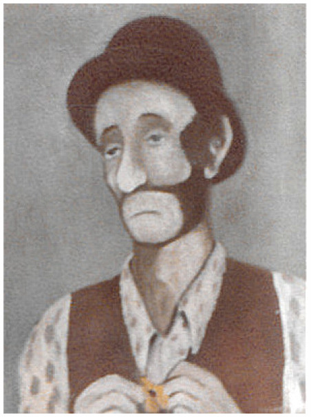
Catalog Information
Title: The Sad Clown
Date: c. 1949-1950
Medium: Oil on canvas
Dimensions: Approximately 22 x 28 inches
Signature: Signed and dated lower right
Credit Line: Known only from photographs--lost around 2012.
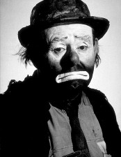
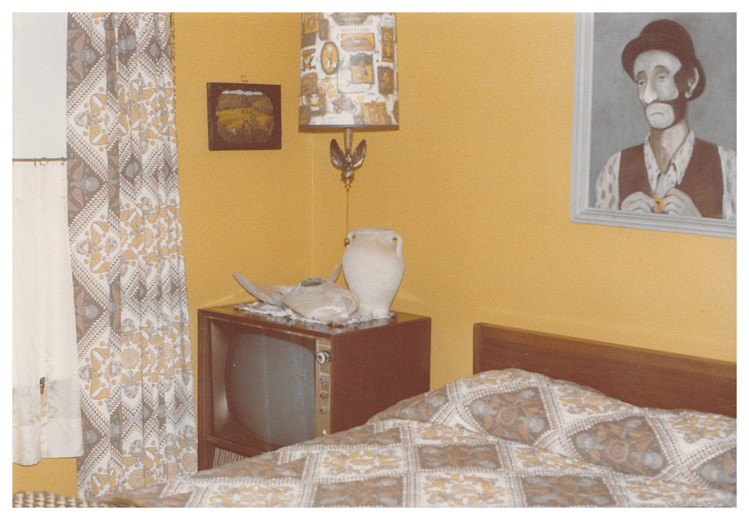
Dad based his painting of The Sad Clown on Emmett Kelly's "Weary Willie" hobo character. The late 1940s date of the painting, indicates that Kelley's character was the inspiration for
Dad's painting reflects the unique intersection of mid-century popular culture and the rigorous foundational training offered by The Ohio State University (OSU) during his tenure from 1946 through 1950. Analysing his style in the context of OSU's Post-WWII Fine Art program reveals several striking parallels.
The Influence of Hoyt Sherman and Visual Unity
During your father's years at OSU, the dominant pedagogical force in the School of Fine and Applied Arts was Professor Hoyt L. Sherman. He was highly influential (famously mentoring pop artist Roy Lichtenstein during the exact same post-war window) and published his landmark book Drawing By Seeing in 1947. Sherman's teaching emphasized "visual unity"--the idea that a painting must be perceived as a cohesive, structured whole rather than a collection of disparate details. Dad's painting exhibits this unified approach through a tightly controlled, compressed tonal palette. The background, vest, hat, and facial shadows all share a harmonious earthy, monochromatic relationship. Instead of getting bogged down in microscopic details, he prioritized the overall silhouette and structural presence of the figure, a classic hallmark of Sherman's focus on instantaneous visual structure.
Form over Realism (The Legacy of James Hopkins)
The department was also heavily shaped by its long-time chairman, James R. Hopkins. He advocated for broad, painterly forms that favored texture, light, and mass over photographic realism. Rather than painting highly detailed fabric textures or hyper-realistic hair, Dad used smooth, generalized geometric masses to define the vest, the curvature of the bowler hat, and the prominent shape of the clown's nose. The focus is strictly on how light shapes form, an academic painting technique drilled into students at OSU in the late 1940s.
The Graphic Sensibility of the Post-War Era
As an art education major, your father would have balanced fine art studio work with design principles. The late 1940s marked a transition where graphic clarity, strong outlines, and poster-like visibility began merging with traditional fine art painting. The character of Emmett Kelly's "Weary Willie" relies on graphic contrast--the stark white paint around the mouth against a dark, unshaven beard. Dad captures this in his painting with deliberate use of bold, dark outlines around the jawline, shoulders, and hat mimics commercial and illustrative trends taught to art educators of that era to ensure images had immediate visual impact.
Mid-Century Regionalism and Humanist Themes
Post-WWII art at OSU didn't just look to European abstraction; it was deeply rooted in American Regionalism and humanism. Artists were encouraged to find dignity in everyday American subjects, the working class, and folk performers. Choosing Emmett Kelly--a cultural icon who turned the tragedy of the Great Depression into a resilient, beloved performance art--perfectly aligns with the thematic trends of the era. Dad's rendering strips away the cheap novelty of a circus clown and gives the character a quiet, somber, and deeply humanistic dignity.
The Late Period (1976-1984)
Dad's later artwork encompassed several landscapes and structures characterized by a distinct American Regionalist style, as well as paintings of scenes from Italy and the Caribbean that reflected moments from overseas trips he and Mom took in the late 1970s and early 1980s. By 1978 he had acquired a 35mm Minolta SLR camera, and many of his later works are based on slides he took abroad. He still painted mostly with oil on canvas, but his later work relied less on the palette knife than on finer brushwork. He still favored a classical, structured approach to composition, relying on the rigorous studio fundamentals he mastered during his time at Ohio State University.
Still Life with Fruit and Ink Bottle
Catalog Information
Title: Still Life with Fruit and Ink Bottle
Date: 1976
Medium: Oil on canvas
Dimensions: Approximately 17 x 22 inches
Signature: Signed and dated middle left
Credit Line: Collection of the Artist's Family
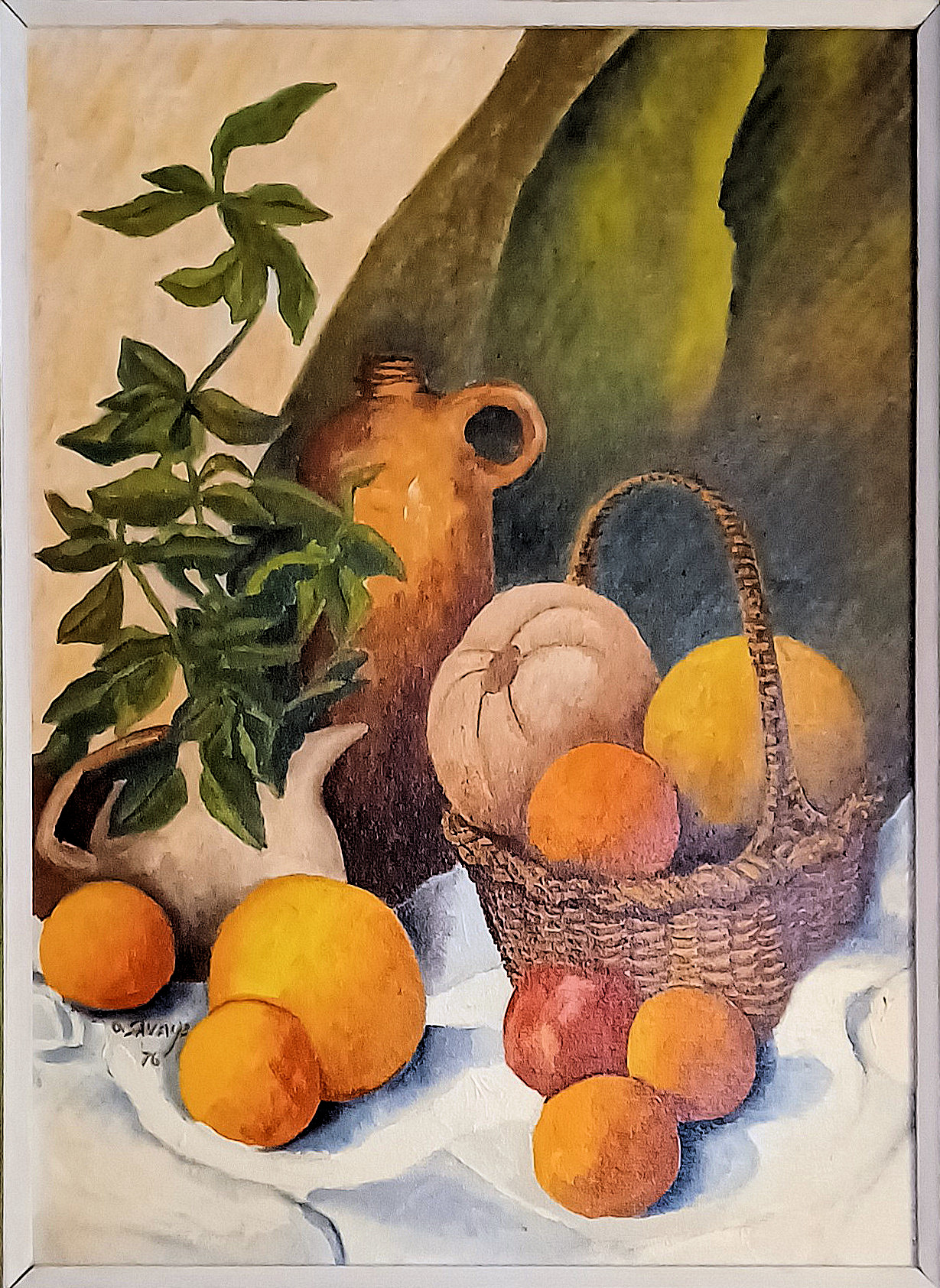
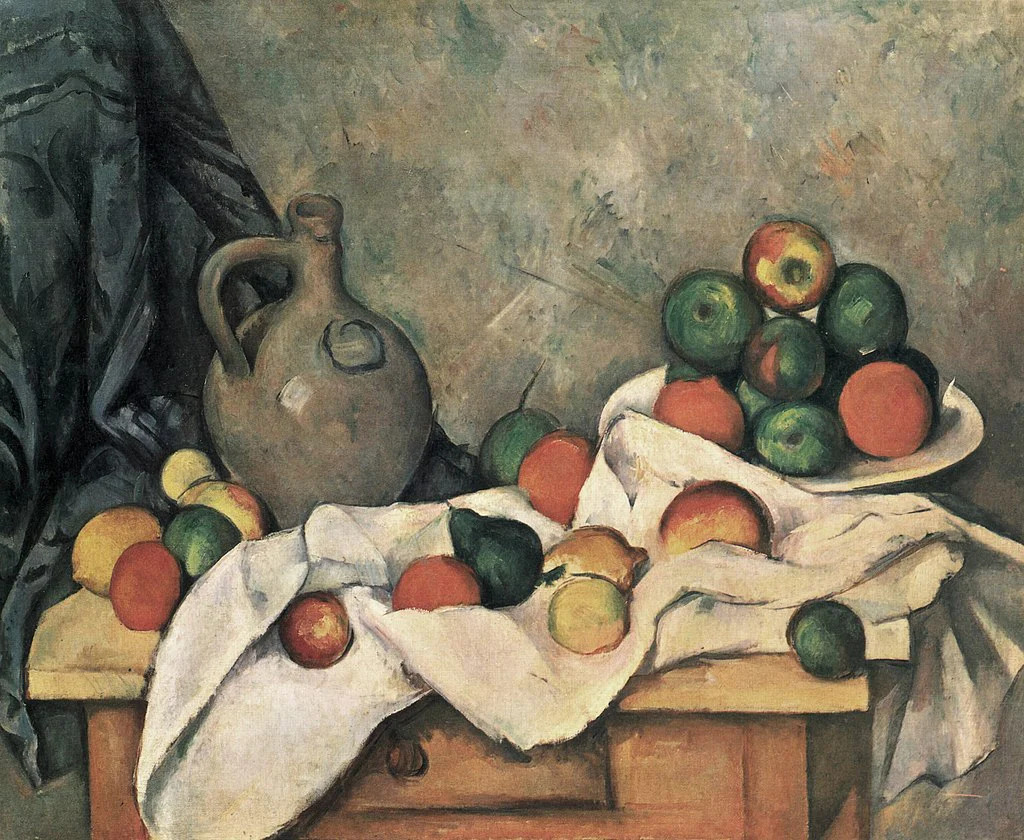
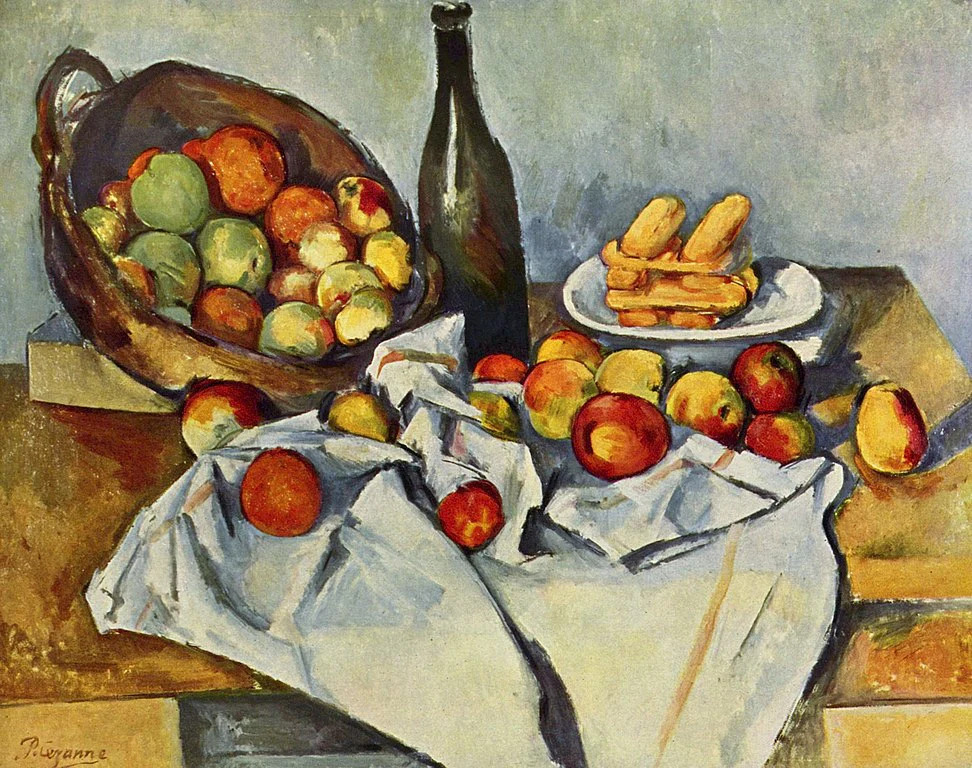
A foundational example of Orville Savage's mature period, this vibrant still life depicts a rich, rustic tabletop arrangement inside his home studio. The composition centers on a finely woven wicker basket overflowing with heavy citrus fruits and melons, juxtaposed with loose oranges cascading onto a crisp white tablecloth. Anchoring the background is a tall, glazed, antique ceramic ink bottle alongside a sprawling green potted plant whose leaves reach dynamically toward the upper left corner. Executed using a hybrid approach, the canvas showcases a tension between fluid brushwork and structured palette knife applications. The background fields and structural shadows feature flat, confident shifts in value, while the fruit demonstrates dense, impasto modeling that accentuates weight and surface texture. Painted in 1973, this piece serves as an important bridge leading into Dad's prolific later creative era (1976-1984). The work synthesizes the formal spatial values, perceptual training, and modernist structural principles he absorbed while studying fine art and education at Ohio State University under the GI Bill in the late 1940s. And he's still channeling Cézanne--compare this and his earlier Still Life with Foliage and Fruit to Cézanne's two paintings.
Modernist Structural Influences
Rather than pursuing pure photographic realism, He leans into a structured, blocky Post-Impressionist idiom reminiscent of Paul Cézanne. The arrangement treats the organic forms of the citrus fruits and the rustic geometry of the ink bottle and basket as fundamental structural masses. The high-angled tilt of the white tablecloth acts as a planar backdrop that pushes the objects forward into the viewer's field of vision, a classic modernist spatial device.
Technical Execution
The duality of his technique is highly effective:
- The Palette Knife is deployed in the background planes, the white drapery folds, and the smooth glaze of the ink bottle, creating broad, geometric shards of color and clean structural definitions. But his use of the knife is much more restrained than the major OSU period painting from 1949, Still Life with Foliage and Fruit.
- The Brushwork brings out the rich, dimpled, tactile surfaces of the oranges, the woven pattern of the basket, and the organic, twisting lifecycle of the potted plant on the left.
- The color palette balances earthy, localized ochres and terracottas against high-key, luminous yellows and warm oranges. This reflects a disciplined, academic color theory that values structural volume and weight over superficial surface detail.
Dad's Evolving Style -- 1949 vs 1976
One way to appreciate Dad's evolving style is by comparing his two paintings, Still Life with Foliage and Fruit, executed at Ohio State, with this painting from his later period. He deliberately chose and set up the objects in Still Life with Fruit and Ink Bottle as a nod to his earlier work (which hung promenently on the kitchen wall). Analyzing these two paintings side-by-side reveals the clear trajectory of an artist evolving from student exploration to mature, deliberate execution.
- Texture and Execution (The Biggest Evolution)
- 1948-49 Work: Features an aggressive, uniform texture. The exclusive use of the palette knife breaks everything down into raw, geometric facets. The canvas texture itself is a major subject of the artwork.
- 1976 Work: Shows technical restraint and variety. Paint is applied smoothly with a brush to let the illusion of the object's real-world texture shine--the woven basket feels brittle, the fruit feels soft, and the cloth feels heavy. The knife is no longer a blunt tool for building the entire scene, but a precision instrument used sparingly for structural definition.
- Spatial Depth and Lighting
- 1948-49 Work: The space is highly compressed and modernist. The background is a dense, textured wall that pushes the still life forward, flattening the composition in a manner reminiscent of late Cubism.
- 1976 Work: Features deep, atmospheric space. The background recedes naturally, and the crisp white tablecloth uses soft blue-gray shadows to create a tangible, three-dimensional surface that projects outward toward the viewer.
- Tone and Intent
- 1948-49 Work: Captures the bold, experimental energy of a young veteran artist absorbing the post-war university avant-garde. It is about breaking rules and exploring the physical boundaries of paint.
- 1976 Work: Reflects a confident, contemplative maturity. The artist is no longer trying to prove mastery over a difficult, singular technique (the knife). Instead, he seamlessly blends his technical toolkit to evoke a sense of quiet permanence, harmony, and classical balance.
Where's the table?
Notice that in the first painting, the right rear corner of the table is missing--it's just background, whereas in the more recent work the table isn't visible at all--it's almost as if the objects are floating on a field of white cloth. This difference captures how Dad shifted away from traditional physical structures to explore more abstract, atmospheric concepts of space. When looking closely at how he handles the support structures in both pieces, it reveals two very different, spatial choices.
The 1948-49 Painting: Spatial Deconstruction
- The "Missing" Corner: Leaving out the right rear corner of the red table is a highly intentional, modern design choice.
- The Spatial Effect: By letting the background bleed directly into the foreground, he breaks the illusion of a realistic 3D room. This technique, heavily popularized by Paul Cézanne and early modernists, intentionally reminds the viewer that a painting is ultimately a flat canvas, not a literal window into a real room. It shows Dad was actively experimenting with cutting-edge, academic design principles during his time at Ohio State.
The 1976 Painting: The Dreamlike Floating Surface
- The "Field of White Cloth": Dad's compositional choice to not show the visible edges of the table entirely completely changes the mood. Furthermore, eliminating the table altogether might have been a continuation of an earlier joke (see "A Deliberate Cubist Gag," above) because it was about this time I pointed out to him that the table in the 1948-49 painting was missing its back, right leg.
- The Spatial Effect: The heavy, white drapery becomes its own landscape. Because we cannot see where the table starts or stops, the objects feel grander and somewhat suspended in space, separated from a standard domestic kitchen setting.
- The Illusion of Weight: Even though the background feels open and almost cloud-like, his mastery of shadows underneath the front fruits keeps them grounded. The objects do not feel weightless; rather, the entire environment feels elevated into a quiet, timeless, almost dreamlike realm.
By moving from a geometric, fragmented table edge in his youth to a seamless, boundless expanse of white cloth in his later periods, Dad successfully traded rigid structural boundaries for an open, elegant atmosphere.
Abandoned Farmhouse on Township Line Road
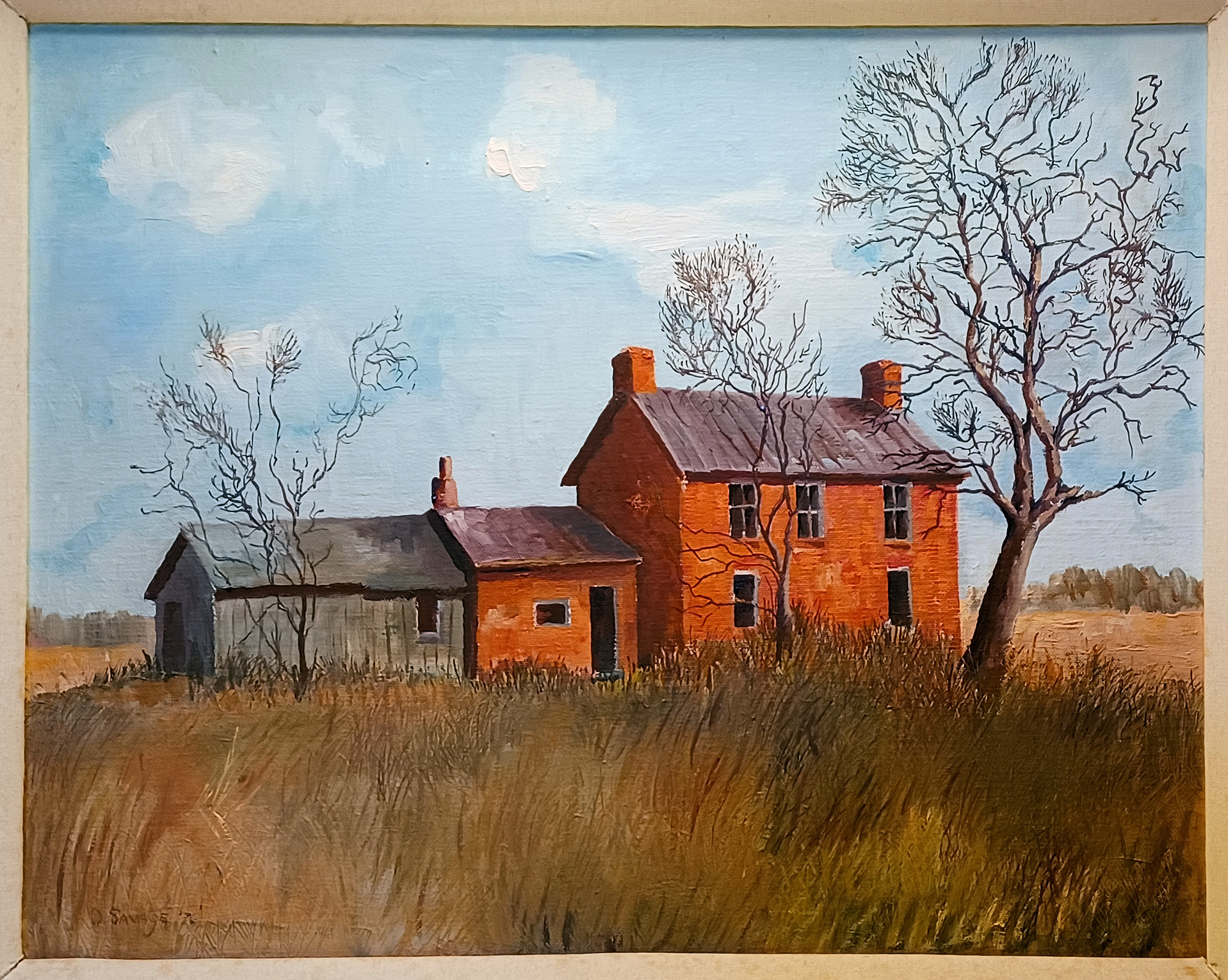
Catalog Information
Title: Abandoned Farmhouse on Township Line Road
Date: 1976
Medium: Oil on canvas
Dimensions: Approximately 16 x 20 inches
Signature: Signed and dated lower left
Credit Line: Collection of the Artist's Family
The painting presents a structured, horizontal composition depicting a desolate rural homestead. The focal point is a two-story, red brick farmhouse with a prominent central chimney and architectural hallmarks of mid-to-late 19th-century vernacular architecture (likely a variant of an I-house or early Federal/Greek Revival farmhouse style common to southwest Ohio). Adjoining the main brick structure is a single-story red brick summer kitchen or wing, which connects to a dilapidated, weathered grey timber outbuilding or lean-to shed on the left. The buildings are deeply embedded within an overgrown, unmanaged field of high, sweeping wild grasses rendered in warm ochre, sienna, and olive tones. The structures are framed by stark, bare winter trees. The skeletal branches of a large tree on the right reach dramatically across the upper quadrant, mirroring smaller dead trees to the left, which heightens the sense of seasonal stillness and decay. The windows of the home are dark, hollow rectangles, emphasizing its abandoned state.
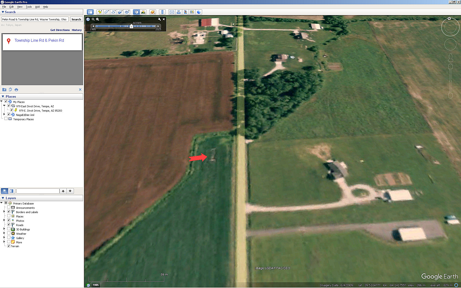
The painting depicts a house on the Miller Farm, south of Lytle, Ohio, on Township Line Road. The house was already present in an 1875 Atlas of Warren County, Ohio--visible as a small square next to a garden or tobacco field. Dad painted it only a few years before the house, which was in an advanced state of deterioration, was torn down. Its remains were bulldozed, and the yard reverted to cropland. A Google Earth satellite image from June, 2009 reveals the exact location of the old farmhouse as a distinct rectangle in the alfalfa that was then growing in the field.
Style and Technique
The painting demonstrates a strong foundation in American Regionalism and Mid-Century Realism, filtering a traditional landscape subject through a structured, mid-20th-century academic lens. Having studied art at Ohio State University in the late 1940s, Dad was exposed to the robust tradition of Midwestern Regionalism (championed globally by artists like Grant Wood and Thomas Hart Benton), alongside post-WWII structural stylization.
- Brushwork & Texture: The paint application utilizes a confident, visible, yet controlled impasto. Dad used short, directional strokes to build the tactile quality of the crumbling brickwork, the splitting wood planks, and the rough, dry texture of the prairie grass. Most of his work was with a variety of brushes. He used a palette knife sparingly to build up the cloud texture.
- Color Palette: The palette balances the vibrant, earthy warmth of the red brick against the muted, melancholic greys of the outbuildings and the dry landscape. The foreground is anchored by heavy earth tones, while the upper background features an expansive, pale cerulean blue sky broken up by soft, textured white clouds. This introduces a bright, crisp atmospheric contrast to the heavy, decaying structures below.
- Light and Atmosphere: The lighting is diffused, casting soft, natural highlights onto the right-facing facades and chimneys, creating subtle geometric depth. The overall mood is elegiac and nostalgic--a formal, respectful documentation of a fading historic landscape.
Resemblance to Historic Warren County Farms
Western Warren County, Ohio--incorporating townships such as Clearcreek, Franklin, Turtlecreek, and areas surrounding Springboro and Lebanon--retains a dense history of late 18th and 19th-century agricultural settlements. Many early pioneer families who migrated from Virginia, Pennsylvania, and New Jersey built substantial brick homes utilizing locally fired clay.
- The I-House Form with Additions: The two-story, side-gabled brick shape with an appended single-story utility room or "summer kitchen" was an incredibly common blueprint for successful 1830s-1860s farms in western Warren County.
- The Toll of Suburban Expansion: By 1976, when Dad painted this piece, western Warren County was beginning to experience rapid suburbanization reaching north from Cincinnati and south from Dayton. Many 19th-century farmsteads along routes like St. Rt. 741, St. Rt. 123, and around the Wayne/Clearcreek and Franklin/Clearcreek township borders fell into complete disuse, were abandoned, or were later demolished for residential developments.
Mom at Coquina Beach
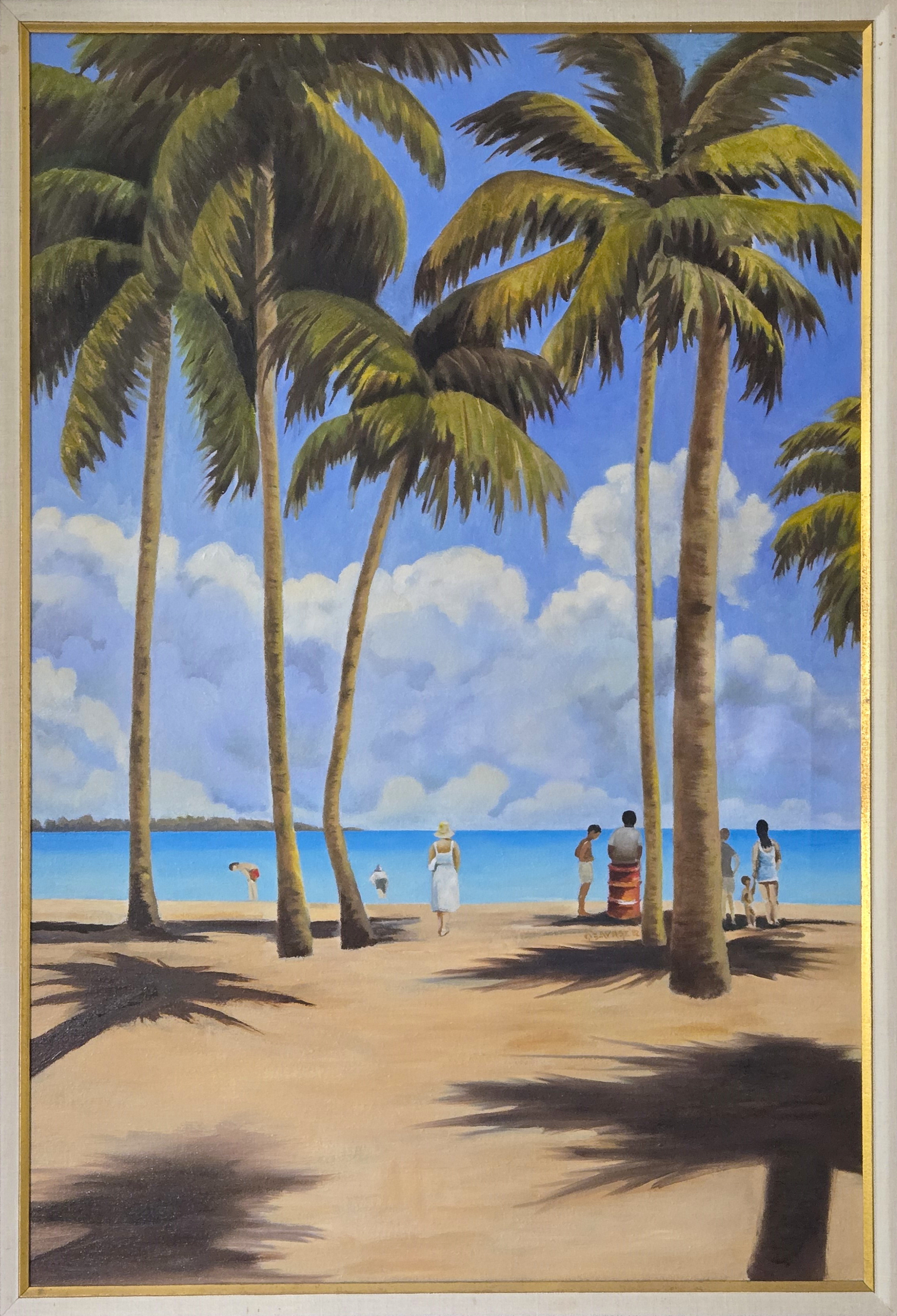
Catalog Information
Title: Mom at Coquina Beach
Date: 1982
Medium: Oil on canvas
Dimensions: Approximately 24 x 36 inches
Signature: Signed and dated middle right
Credit Line: Collection of the Artist's Family
The composition shows Betty, captured from behind as she stands at the water's edge looking out toward the horizon. Framed by a dramatic, towering colonnade of Florida palm trees, the scene captures a localized snapshot of coastal life, featuring beachgoers and a distinct coastal oil drum along the shoreline. The piece showcases Dad's handling of light and shadow, using hard-edged foreground shadows to create dramatic depth against the brilliant blues of the Gulf Coast. This canvas exemplifies his later coastal works, filtering the bright atmosphere of Florida through the disciplined, structured lens of his fine art training at Ohio State University.
Based on the geography of Bradenton and the physical features shown in the painting, the scene depicts Coquina Beach or the southern end of Anna Maria Island, looking across Longboat Pass toward the northern tip of Longboat Key. The thin strip of land visible across the turquoise water represents the northern tip of Longboat Key. Coquina Beach is famous for its dense, towering groves of coconut palms that extend right onto the sand, producing the deep, long shadows cast toward the foreground. The brightly colored red oil drum acts as a nostalgic historical marker. In the 1970s and 1980s, these painted metal drums were commonly used as public trash receptacles along Florida's public Gulf beaches.
Art Historical Context: The OSU Influence
During Dad's time at Ohio State University, the fine art department was a hotbed for mid-century modernism, heavily emphasizing structural composition, spatial design, and the emerging tenets of American Regionalism and Post-Impressionism. And even though his style had matured from his student days, he was still influenced by those early emphases.
- Structural Geometry and Mid-Century Design: The influence of his formal education is apparent in how he structured the composition. Instead of a casual snapshot, the palm trees act as rigid vertical columns, dividing the canvas into harmonious geometric segments. The deep foreground shadows create a distinct grid pattern that guides the viewer's eye into the space.
- Stylized Realism: Rather than chasing strict photographic realism, your father utilized stylized forms--seen clearly in the crisp, rounded shapes of the cumulus clouds and the simplified contours of the human figures. This leans into mid-century illustration and modernist painting techniques taught to art educators of that era.
- Thematic Contrast: The composition cleverly pairs the timeless majesty of nature (the ancient palms and the vast sea) with everyday, casual human elements (the beachgoers and the utilitarian oil drum). This balance echoes mid-century Regionalist traditions, which celebrated authentic American life as it was experienced.
The composition shares distinct visual and structural techniques with several major movements and artists that were heavily studied in American universities during the late 1940s.
- The Regionalism of Grant Wood and Thomas Hart Benton: Because Dad studied in the Midwest immediately following the heyday of American Regionalism, the geometric clarity of his composition strongly echoes this movement. Look at the stylized, perfectly rounded, puffy white clouds and the smooth, almost sculptural quality of the palm fronds. This technique is highly reminiscent of Grant Wood's landscapes, which reduced rolling Iowa hills and trees into pristine, simplified geometric volumes. Regionalists sought to elevate everyday American scenes with formal clarity. Dad applied this midwestern regionalist approach to a modern Florida coastline.
- The Spatial Architecture of Edward Hopper: The composition strongly resembles the work of Edward Hopper, who frequently painted isolated figures captured in moments of quiet contemplation, often gazing into an open horizon or out of windows. Like Hopper, Dad used harsh, dramatic sunlight to create long, stark shadows that map out the ground. The figures are placed like chess pieces across the sand, creating a narrative of peaceful solitude rather than a chaotic beach party.
- The Graphic Balance of Post-Impressionism: The way the vertical palm trees aggressively cut through the canvas to slice up the sky and horizon line mirrors how Paul Gauguin structured his Tahitian beach landscapes. Gauguin frequently used tree trunks as massive vertical anchoring frames to flatten the depth of a tropical scene. Dad used the natural verticality of Florida's palms not just as scenery, but as a deliberate graphic design tool to frame his subjects.
- Pierre Puvis de Chavannes and Classical Allegory: The central placement of a single woman in white, viewed from behind as she looks at the ocean, has deep roots in late 19th-century academic art. French painter Pierre Puvis de Chavannes' famous beach compositions frequently featured idealized, statuesque figures clad in light garments, standing on a shore looking out toward a timeless horizon. Dad translated this classical, poetic trope of "the lone figure and the infinite sea" into a modern 1982 setting, turning an ordinary beach visit into something monumental and enduring.
Coquina Beach 1
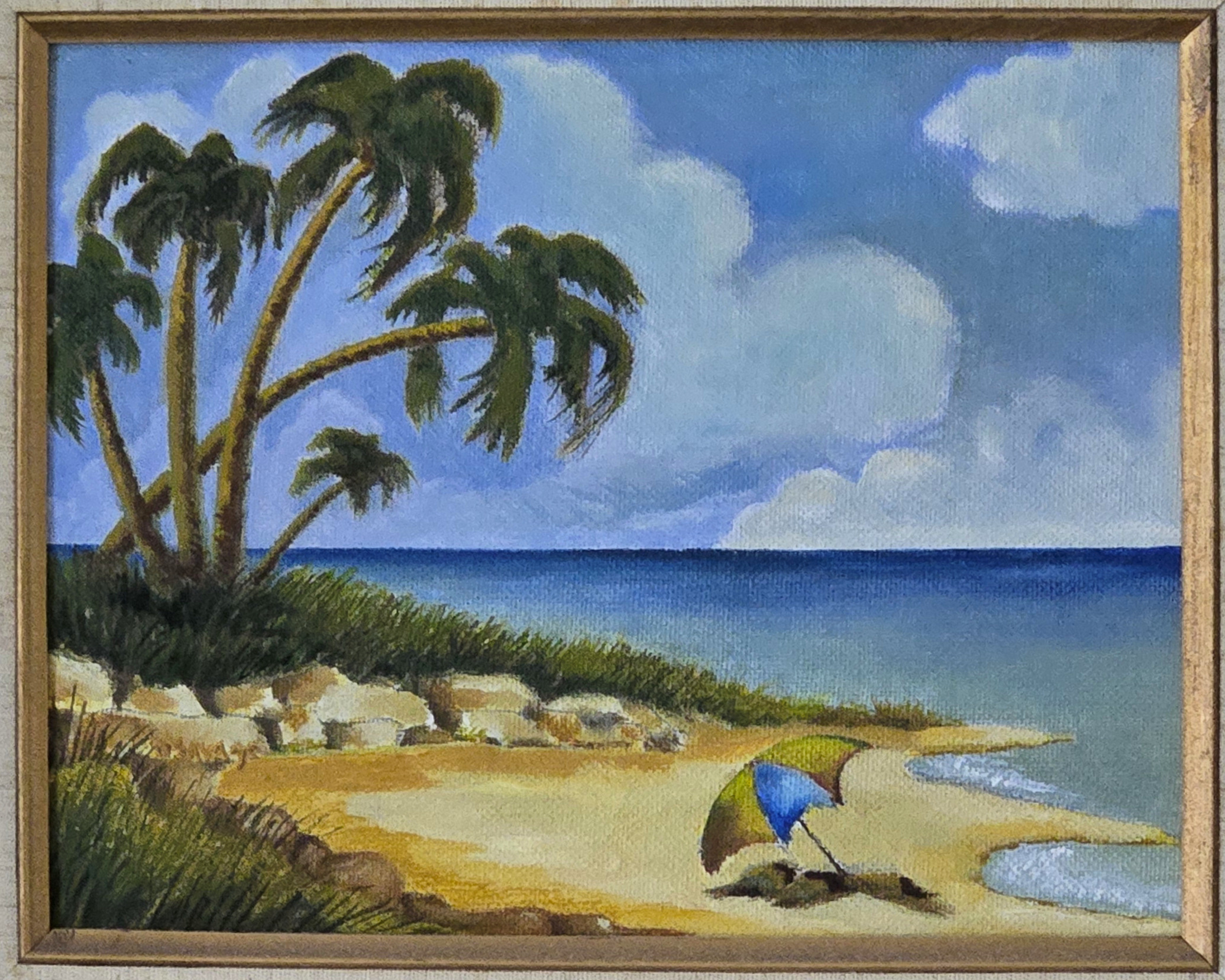
Catalog Information
Title: Coquina Beach 1
Date: 1982
Medium: Oil on canvas board
Dimensions: Approximately 14 x 10 inches
Signature: Signed in lower left quadrant
Credit Line: Collection of the Artist's Family
Description: A vibrant, rhythmic mid-century coastal landscape documenting Coquina Beach at the southern tip of Anna Maria Island, Florida. The foreground features a solitary, multi-colored beach umbrella resting on the sand beside a prominent outcrop of coastal limestone rocks and native dune grasses. A dramatic cluster of mature palm trees sweeps gracefully from the left margin, framing an expansive, painterly sky filled with building midday cumulus clouds. The deep blue horizon of the Gulf of Mexico stabilizes the composition, capturing the serene, sun-drenched atmosphere of the Gulf Coast in the early 1980s.
Dad did these four paintings in rapid succession, as a group to accompany the larger Mom at Coquina Beach, and they were always displayed with two on each side of the larger work. None of the four has an historic name, in the sense of what Dad or Mom would have called them. And Dad never, as far as I remember, said what they depicted specifically. But I am certain they are all different views of Coquina Beach, and have named them accordingly.
Why Coquina Beach Connects to the Group
- The Limestone Rock Formations: Coquina Beach gets its name from the soft, shell-based limestone rock (coquina) native to the area. The light-colored boulders he painted along the dune line are highly accurate representations of the erosion control structures and natural rock outcroppings specific to this exact stretch of coastline.
- The Australian Pines and Palms: While Coquina Beach is famous for its shaded path of towering Australian pines just off the sand, its dunes transition into clusters of wild, leaning palms exactly like the ones anchoring the left side of his composition.
- The Changing Shoreline: In 1982, Coquina Beach had a much more rugged, natural dune line before modern nourishment projects widened the sand. Your father perfectly captured the intimate, untouched character of the beach from that era.
Coquina Beach 2
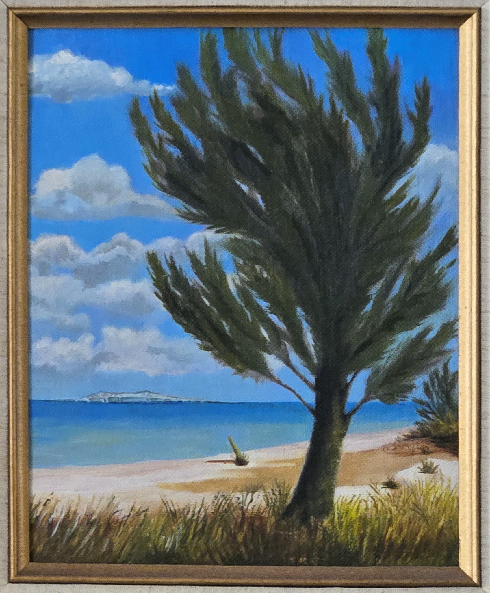
Catalog Information
Title: Coquina Beach 2
Date: 1982
Medium: Oil on canvas board
Dimensions: Approximately 10 x 14 inches
Signature: Signed in lower right quadrant
Credit Line: Collection of the Artist's Family
Description: A coastal landscape study depicting a local Australian Pine tree leaning over the sandy shore of Coquina Beach, Florida. In the background, turquoise coastal waters lead to a distant island under a bright blue sky filled with cumulus clouds.
Historical Context: 1982 Coquina Beach
Dad captured Coquina Beach during a nostalgic period of Florida's Gulf Coast history--before heavy commercial development fully reshaped the surrounding islands. His choice of lone beach umbrellas emphasizes the peaceful, uncrowded serenity that artists and locals loved about the southern end of the island at that time.
Coquina Beach 3
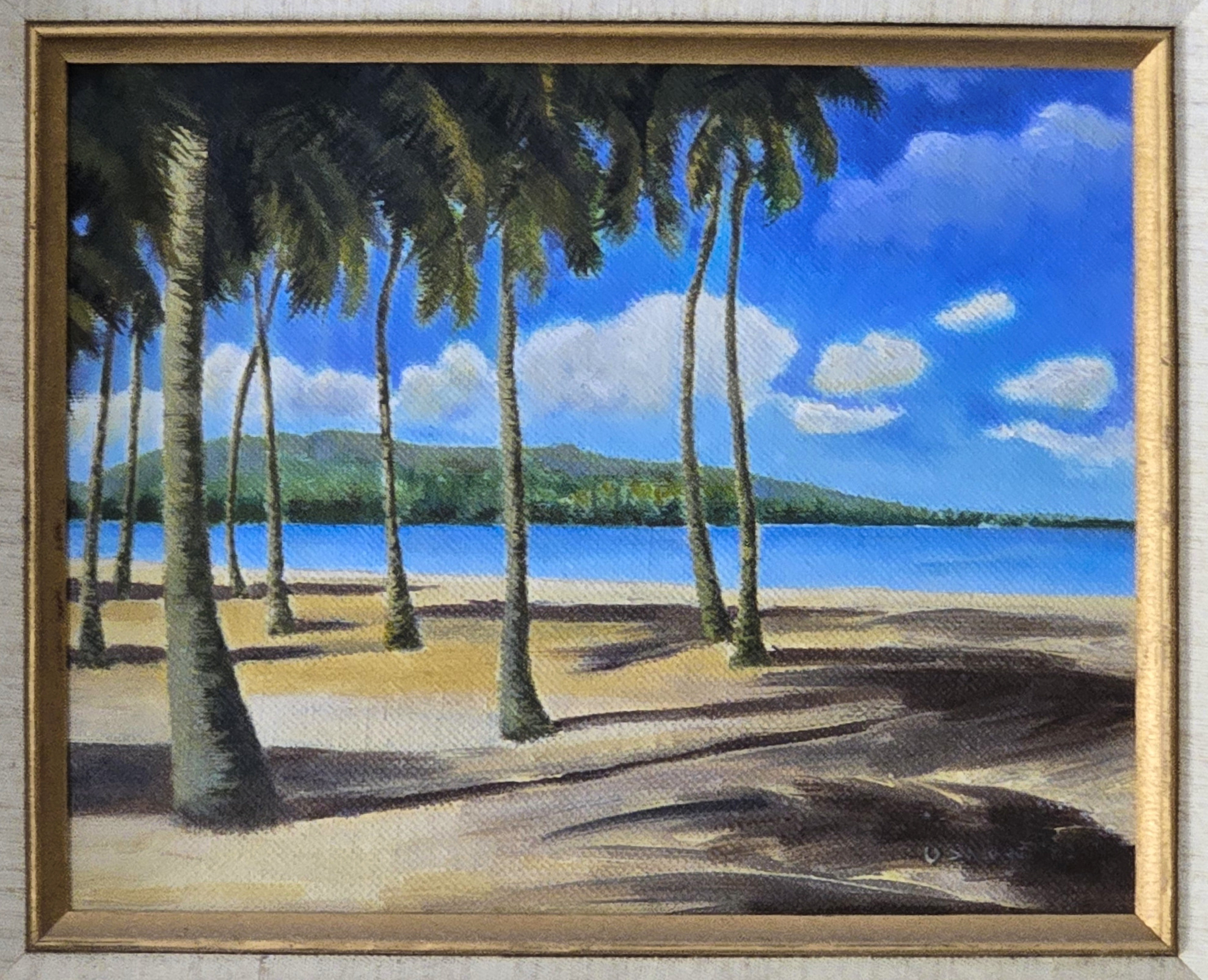
Catalog Information
Title: Coquina Beach 3
Date: 1982
Medium: Oil on canvas board
Dimensions: Approximately 14 x 10 inches
Signature: Signed in lower left quadrant
Credit Line: Collection of the Artist's Family
Description: A luminous landscape depicting a dense grove of mature palm trees on a sandy shoreline in the Bradenton/Sarasota area. The composition utilizes a strong diagonal foreground shadow matrix that guides the viewer's eye across the sand to an open turquoise inlet, framed by a distant, verdant barrier island under a brilliant blue sky dotted with fair-weather cumulus clouds. Based on the visual composition and landmarks, this scene represents Anna Maria Island looking across Passage Key Inlet toward Egmont Key or the distant hills of the Tampa Bay shipping channel infrastructure. Specifically, the vantage point matches the northern tip of Anna Maria Island (near Bean Point in Bradenton), where rows of coastal palms open up to a wide sandbar beach, looking directly north across the water toward the natural barrier islands protecting the mouth of the bay. The low-lying green landmass across the water corresponds perfectly to the silhouette of Egmont Key as viewed from the northern shore of Manatee County.
Coquina Beach 4
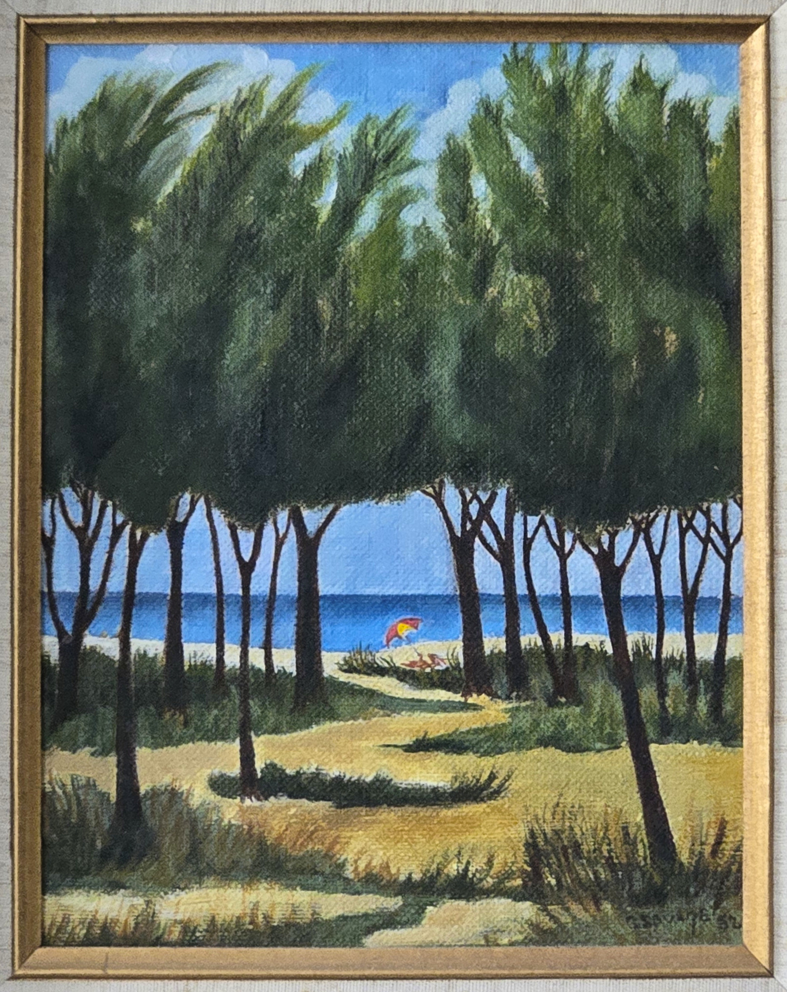
Catalog Information
Title: Coquina Beach 4
Date: 1982
Medium: Oil on canvas board
Dimensions: Approximately 10 x 14 inches
Signature: Signed and dated in lower right quadrant
Credit Line: Collection of the Artist's Family
Description: This piece almost certainly depicts a view looking out onto the Gulf of Mexico from one of the region's barrier islands. The visual clues point directly to Anna Maria Island (specifically Coquina Beach or Longboat Key). The dense canopy of tall, thin-trunked Australian Pines framing the view is characteristic of Coquina Beach at the southern tip of Anna Maria Island. Planted heavily in the mid-20th century to prevent erosion, these trees created shaded, cathedral-like groves right against the sand dunes. The sandy trail weaving through the sea oats and low scrub brush perfectly captures the natural pedestrian cut-throughs that lead visitors from the shaded parking areas, through the pine hammocks, out to the open beach.
Style, Influences, and Technique in the Group
Mid-Century Regional Impressionism and the Florida Highwaymen18: Dad's artistic training occurred during a pivot point in American art history. While Abstract Expressionism was taking over the New York art world, mid-western academic institutions heavily grounded their students in structural composition, post-impressionist color theory, and regionalist landscape painting. These paintings share a distinct kinship with mid-century Florida landscapes. Though Dad was formally trained at Ohio State University, his work here beautifully mirrors the spirit of the mid-century Florida Highwaymen and earlier Florida landscape artists. These artists prioritized capturing the wild, idyllic, and atmospheric qualities of the changing Florida coastlines.
Brushwork and Form: Executed primarily with a loaded brush, he used definitive, deliberate strokes to sculpt forms rather than blend them into soft realism. The palm fronds are painted with thick, confident marks that give them weight and movement.
Impasto Accents: There is a light use of impasto (thickly applied paint), particularly visible in the treatment of the rolling white cumulus clouds. This gives the sky an undulating, tactile quality that contrasts beautifully with the flat, smooth horizontal band of the deep blue Gulf waters.
Sailboats on the Venice Lagoon
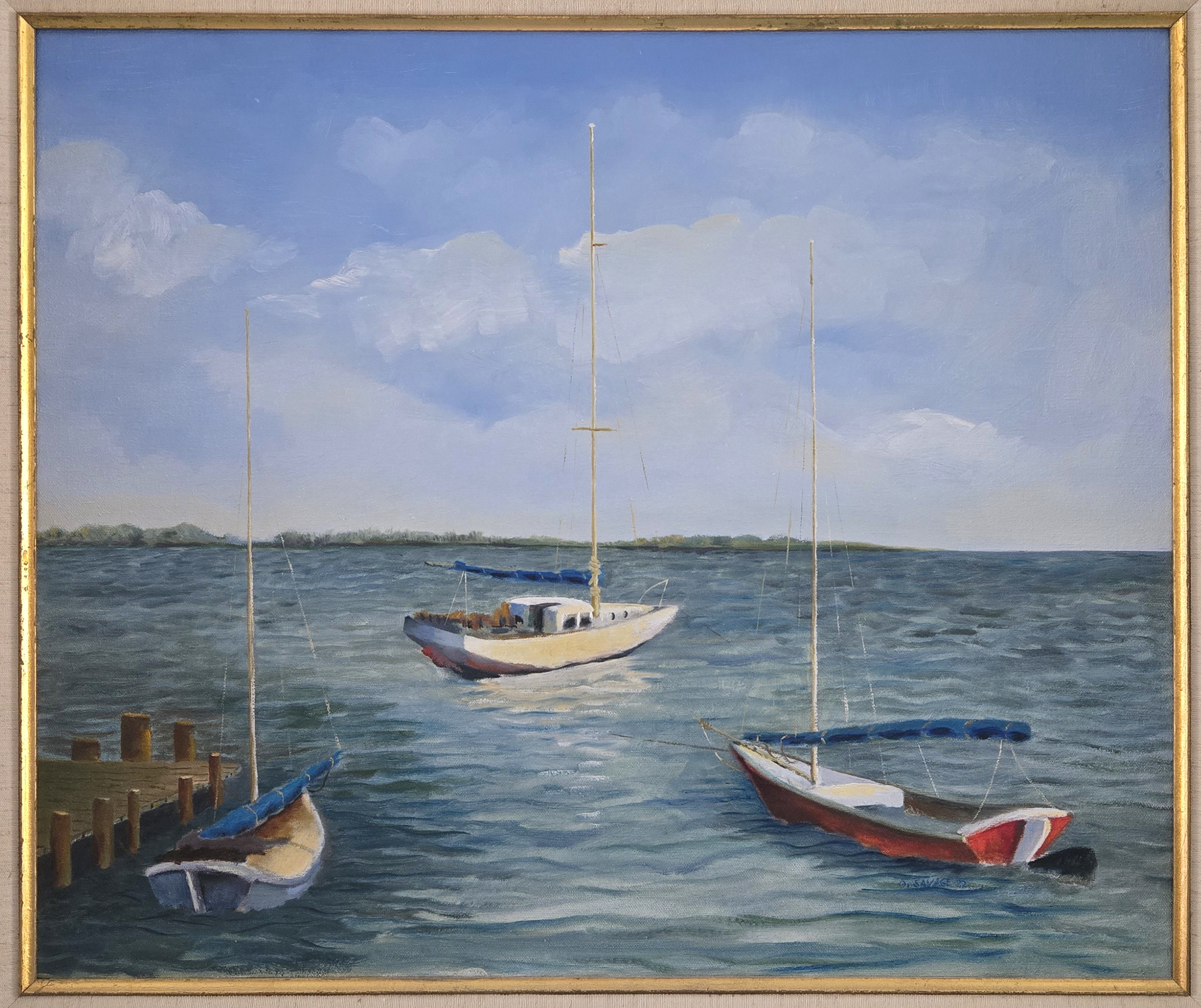
Catalog Information
Title: Sailboats on the Venice Lagoon
Date: 1982
Medium: Oil on canvas
Dimensions: Approx. 20 x 24 inches
Signature: Signed and dated in below the red boat
Credit Line: Collection of the Artist's Family
A maritime landscape depicting three sailboats anchored in the open waters of the Venetian Lagoon under a partly cloudy blue sky. A small wooden pier structure stands at the left foreground, while a low, green island spit runs along the horizon line. This serene composition beautifully captures the vast, open atmosphere of the Venetian Lagoon (Laguna di Venezia), moving away from the typical crowded canal scenes of inner Venice to show its maritime landscape, looking toward one of its low-lying peripheral islands or long barrier spits.
Geographical Context: Locating the Scene
The scene is captured from the open waters of the Venetian Lagoon, looking toward one of its low-lying peripheral islands or long barrier spits, such as Lido di Venezia or Pellestrina. The orientation of the wooden pilings (bricole or a low mooring dock) on the left indicates a small anchorage spot or perimeter embankment rather than a bustling urban quay. The flat, continuous strip of green vegetation along the horizon line is characteristic of the outer lagoon islands or the salt marshes (barene), which separate the deeper navigational channels from the Adriatic Sea. This perspective offers a peaceful counterpoint to the architectural density of Venice's historic center.
Style, Influences, and Technique
The painting operates within the realm of Impressionistic Realism. Instead of focusing strictly on crisp details, the work prioritizes the mood, temperature, and atmospheric light of the lagoon. The influence of French Impressionist maritime painters--such as Eugène Boudin and Claude Monet--is visible in how the vast sky and fluctuating water surface dominate the canvas. There is also a distinct American regionalist sensibility in its honest, unromanticized depiction of everyday working vessels and functional docks. The dual use of brush and palette knife builds an intentional, tactile contrast between the elements:
- The Sky and Distance: Executed primarily with soft, blended brushwork to create the weightless, shifting quality of the cumulus clouds and the hazy, atmospheric recession of the horizon.
- The Water and Boats: The palette knife is used here to lay down thicker, more deliberate impasto strokes. This captures the choppy, fractured texture of the lagoon water and the flat planes of the boat hulls.
- Color Palette: The palette is dominated by a harmonious range of cerulean and cobalt blues, balanced by the earthy, warm tones of the wooden docks and the striking red hull of the foreground vessel, which serves as a vibrant focal point.
Gondolier near Ponte della Canonica
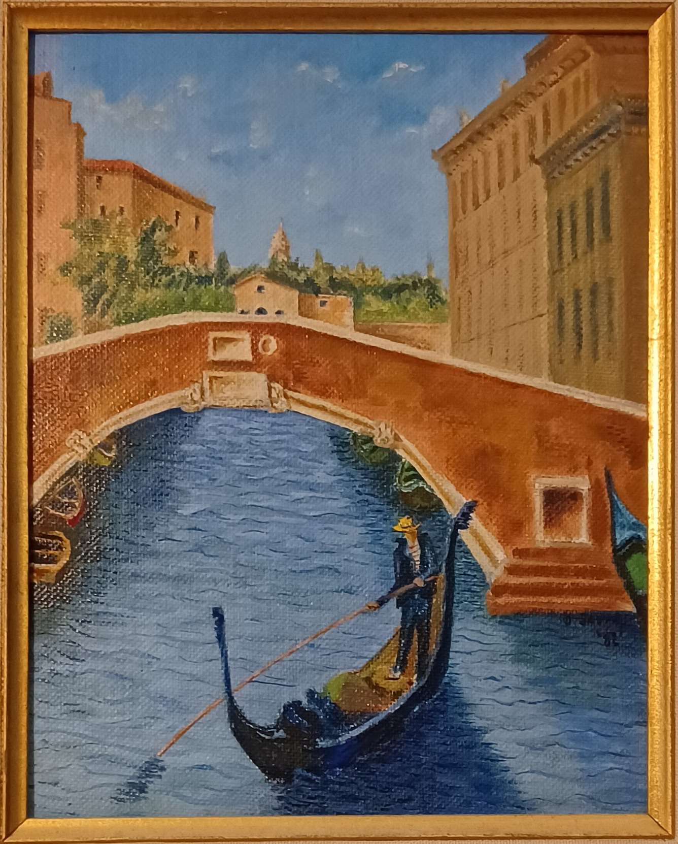
Catalog Information
Title: Gondolier near Ponte della Canonica
Date: 1982
Medium: Oil on canvas board
Dimensions: Approximately 8 x 10 inches
Signature: Signed and dated in lower right quadrant
Credit Line: Collection of the Artist's Family
Description: A localized canal landscape of Venice, Italy, depicting a single gondolier navigating a classic black gondola beneath the brick arch of the Ponte della Canonica. The water of the Rio di Palazzo canal is rendered in textured blues via palette knife work, contrasting with the detailed architectural brickwork of the bridge and the soaring facades of the Doge's Palace on the right bank. Mid-distance features show terracotta-roofed Venetian structures set against a soft, cloud-swept blue sky.
These two small paintings were always displayed as a pair, one on either side of the larger Sailboats on the Venice Lagoon painting.
Geographic Location
The scene is viewed looking north up the Rio di Palazzo canal. The prominent brick archway in the foreground is the Ponte della Canonica, an ancient stone bridge located just behind St. Mark's Basilica. If the viewpoint had been rotated to face the opposite direction (south toward the lagoon), it would have captured the famous Bridge of Sighs. The building rising on the right side of the canal is the rear facade of the historic Doge's Palace.
Venetian Canal Intersection
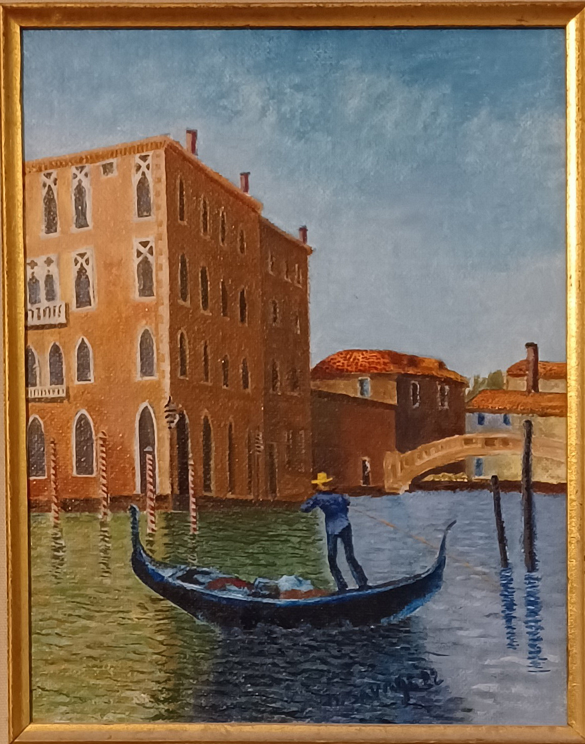
Catalog Information
Title: Venetian Canal Intersection
Date: 1982
Medium: Oil on canvas board
Dimensions: Approximately 8 x 10 inches
Signature: Signed and dated in center bottom
Credit Line: Collection of the Artist's Family
Description: A vibrant, atmospheric composition depicting a lone gondolier navigating a narrow canal waterway in Venice, Italy. To the left, a multi-story Gothic-style palazzo rises directly out of the water, its facade rendered in rich terracotta tones with deeply recessed arched windows. In the background, a small stone footbridge links the flanking neighborhoods under a clear, bright sky. The work is executed using a combination of dynamic brushstrokes and structural palette knife applications, emphasizing the physical texture of weathered stucco and the shifting reflections of light upon the water's surface.
Geographic Location in Venice
The composition depicts a classic intersection of canals in the Cannaregio district. The prominent building on the left, with its distinct Gothic lancet windows and a facade directly meeting the water, is highly consistent with the side profile of the Palazzo Soranzo Van Axel or the structures surrounding the Rio de la Panada and Rio di San Canciano. This quiet corner of Venice is famed for its intersecting waterways, narrow brick bridges connecting the foundations (fondamenta), and wooden mooring poles (pali di casada) stuck into the canal bed.
Style, Influences, and Technique in Both Paintings
Style and Artistic Movement: The painting sits firmly in the realm of Mid-Century Mid-Western Realism influenced heavily by Post-Impressionism. Having attended Ohio State University in the late 1940s, Dad was exposed to a curriculum that balanced rigorous classical foundation with the expressive freedom of European modernism. Rather than trying to replicate the pristine, photorealistic grand views (vedute) of 18th-century masters like Canaletto, he chose a highly personal, atmospheric interpretation.
Compositional Influences: Because the work was translated from a 35 mm slide taken several years prior, it inherits a photographic sense of framing. The compression of the background buildings and the low-angle perspective from the water indicate photographs taken while on a boat or a low bridge. The inclusion of the gondolier provides an intentional focal point, a nod to the romanticism of the Grand Tour artists. However, Dad avoided tourist-brochure gloss for a gritty, lived-in depiction of the city's ancient architecture.
Technique and Execution
- Palette Knife and Brush Work: The architectural elements showcase a confident use of a palette knife to block out the mass of the buildings. This technique gives the terracotta stucco a rugged, crumbling texture that mirrors the real-world decay of Venetian stone.
- Impasto in Water Textures: He utilized an impasto technique (thickly applied paint) in the foreground. The water is constructed out of deliberate, horizontal knife and brush strokes, catching the light in fractured pieces of green, ochre, and blue.
- Color Theory: Reflecting his formal Fine Arts education, the color choices rely on complementary contrasts. The warm, rich burnt sienna and terracotta tones of the buildings are dynamically balanced by the cool teal-greens of the canal and the soft, expansive sky.
Ligurian Harbor (Portofino)
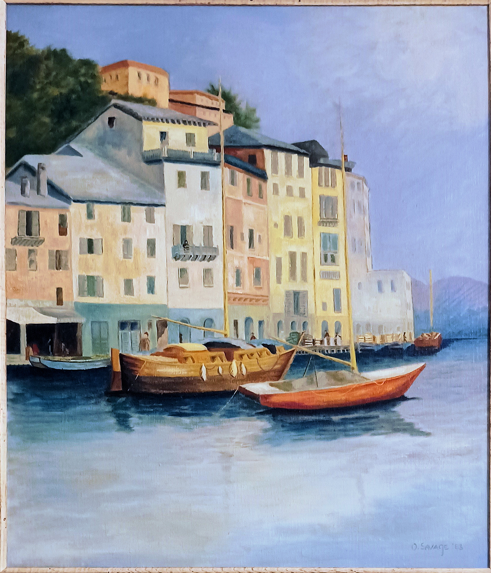
Catalog Information
Title: Ligurian Harbor (Portofino)
Date: 1983
Medium: Oil on canvas
Dimensions: Approx. 20 x 24 inches
Signature: Signed and dated lower right
Credit Line: Collection of the Artist's Family
My favorite of Dad's later paintings, this one depicts a serene, mid-day perspective of the iconic inner harbor of Portofino, Italy. The composition features a cluster of multi-story Mediterranean buildings tiered closely along the waterfront against a lush green hillside. The structure tones range from pale yellow and soft cream to delicate terracottas and muted blues. Two traditional wooden fishing hulls are moored in the foreground alongside a small, rust-orange sailboat, casting soft reflections onto the glassy aquamarine water. The painting translates a single, personal slice of travel photography into a permanent, tactile architectural memory.
Painting Style
Dad's approach blends Mid-Century Post-Impressionism with a clear background in Classical Structural Design, highly characteristic of formal university arts training from the mid-20th century.
- Geometric Precision: The influence of a trained artist's eye is evident in how the complex angles of the Ligurian buildings are systematically arranged. Rather than abstracting the scene, he stabilizes the architecture using crisp lines and careful vertical framing.
- Controlled Impasto: The brushwork is deliberate, painterly, and controlled. He favors a smooth, blended execution over chaotic textures, letting the natural viscosity of the oil paint mimic the smooth plaster facades of the Italian structures.
- Chiaroscuro & Value: The work showcases an excellent grasp of mid-century realism, emphasizing deep under-canopy shadows and contrasted window voids to give the flattened planes of the buildings three-dimensional weight.
The Evolution of Portofino's Color Palette (1970s-1990s)
The 1983 painting serves as an excellent historical record, because the external walls of Portofino underwent a massive legal and aesthetic shift between the time Dad snapped his photograph (1978) and the turn of the century. His canvas perfectly traps a specific window in time--preserving the soft, romantic, and slightly weathered coastal palette of pre-hyper-commercialized Italy.
The 1970s: The Era of Weathered Authenticity. When the reference photo was taken in 1978, Portofino's buildings still bore the marks of organic history. The paints used were traditionally lime-based washes mixed with local mineral pigments (sienna, umber, and ochre). In the past, these organic colors were frequently applied al fresco, when the exterior plaster was still wet. Exposed to decades of aggressive maritime salt air, the facades naturally faded into highly oxidized, soft, powdery tones. This is precisely why the painting features subtle, chalky cream-yellows and dusty terracottas--it captures the village before modern chemical paints and strict tourism-driven restorations took hold.
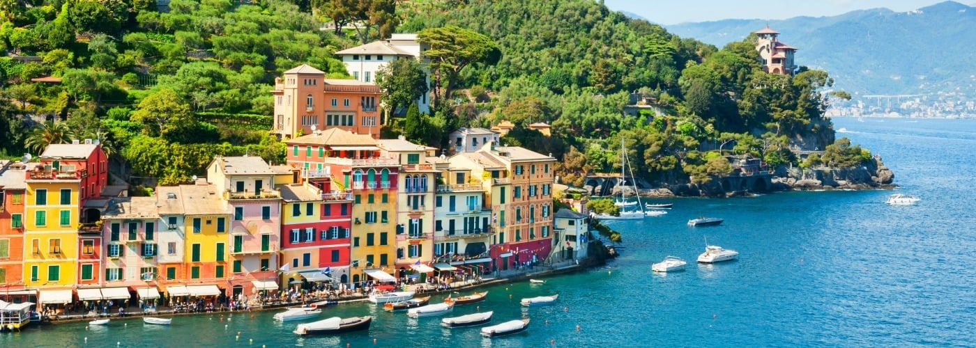
The 1980s to 1990s: The "Piano del Colore" Palette. As Portofino transitioned into a high-end luxury resort hub for global tourism, local municipalities noticed that unregulated modern renovations threatened the village's identity. To fix this, Italy introduced stricter regional architectural mandates, culminating in standardized municipal color plans (Piano del Colore). Property owners were legally restricted to a specific, historically approved color wheel. Modern, synthetic silicate paints replaced the old mineral washes. These newer compounds resisted fading from UV rays and salt water. By the 1990s, the soft, dusty pastels captured in this 1983 painting were replaced by deep, uniform, highly saturated primary ochres, vivid bricks, and pristine terracottas.
Castillo San Felipe del Morro, Puerto Rico
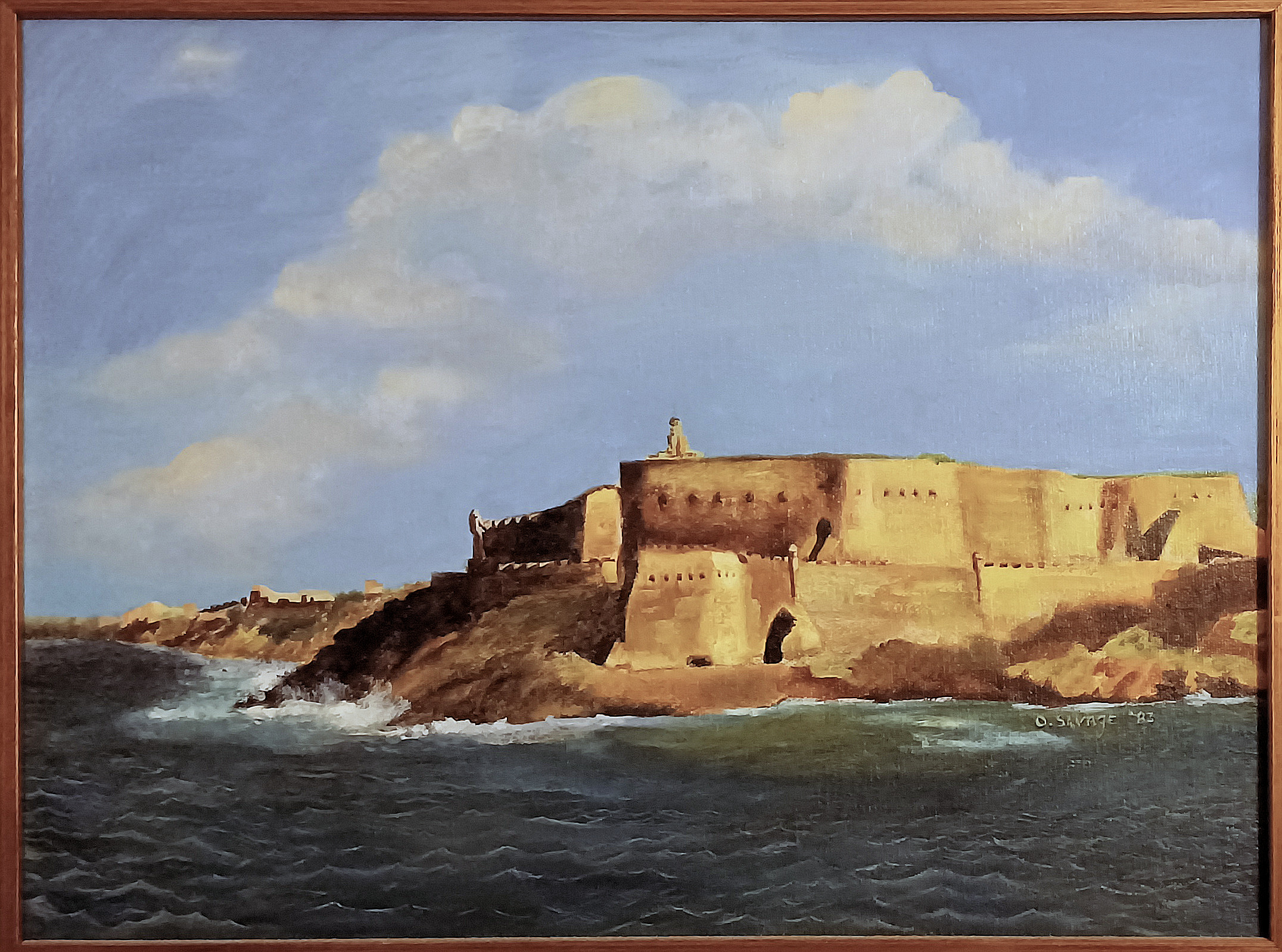
Catalog Information
Title: Castillo San Felipe del Morro, Puerto Rico
Date:1983
Medium: Oil on canvas
Dimensions: Approximately 16 x 12 inches
Signature: Signed and dated lower right
Credit Line: Collection of the Artist's Family Description: The painting captures the military architecture of El Morro, a 16th-century fortress designed by Spanish engineers to guard San Juan Bay against seaborne invaders.
A sun-drenched architectural marine landscape depicting the historic Spanish fortress Castillo San Felipe del Morro in San Juan, Puerto Rico. Executed from a low, sea-level vantage point, the painting captures the sheer scale of the massive limestone and sandstone walls as they rise directly out of a rugged, wave-swept promontory. The warm afternoon light strikes the fortress face from the right side, casting dramatic shadows and highlighting the texture of the historic masonry and the iconic round sentry box (garita) perched on the upper bastion. In the foreground, choppy deep blue-green waves with white crests break against the dark rocky shoreline. The composition is balanced by a vast blue sky filled with expansive, luminous cumulus clouds that mirror the soft, earthy tones of the citadel below.
The painting is an excellent example of Mid-Century American Realism blended with Impressionistic brushwork, heavily informed by travel photography from the late 1970s.
Mature Technique and Compositional Mastery
As a later career piece completed over thirty years after his formal training at Ohio State, the painting shows Dad's refined compositional maturity. The composition relies on a "Snap-Shot" perspective derived from a travel slide taken from a cruise ship. This bypasses the static, front-facing framing found in textbook illustrations, favoring an immediate, traveler's-eye view that moves dynamically past the cliffs.
Brushwork and Texture
- Impasto and Scumbling: Short, dense brushstrokes block out the fort, giving the stone walls a tactile, weathered appearance that mimics real coral limestone.
- Fluid Movement: The water is captured with long, horizontal strokes of rich cerulean and viridian, accented by quick, textured white strokes to represent the churning sea spray.
Color Palette & Light
The palette is deeply reminiscent of vintage photographic film from the late 1970s. Savage relied on warm, golden ochres, rich sienna, and earth tones for the fortress structure. These warm colors are directly contrasted against the cool, crisp blues of the sea and sky, perfectly evoking the intense, clear atmosphere of a tropical Caribbean afternoon.
Port Au Prince Street Scene, Haiti
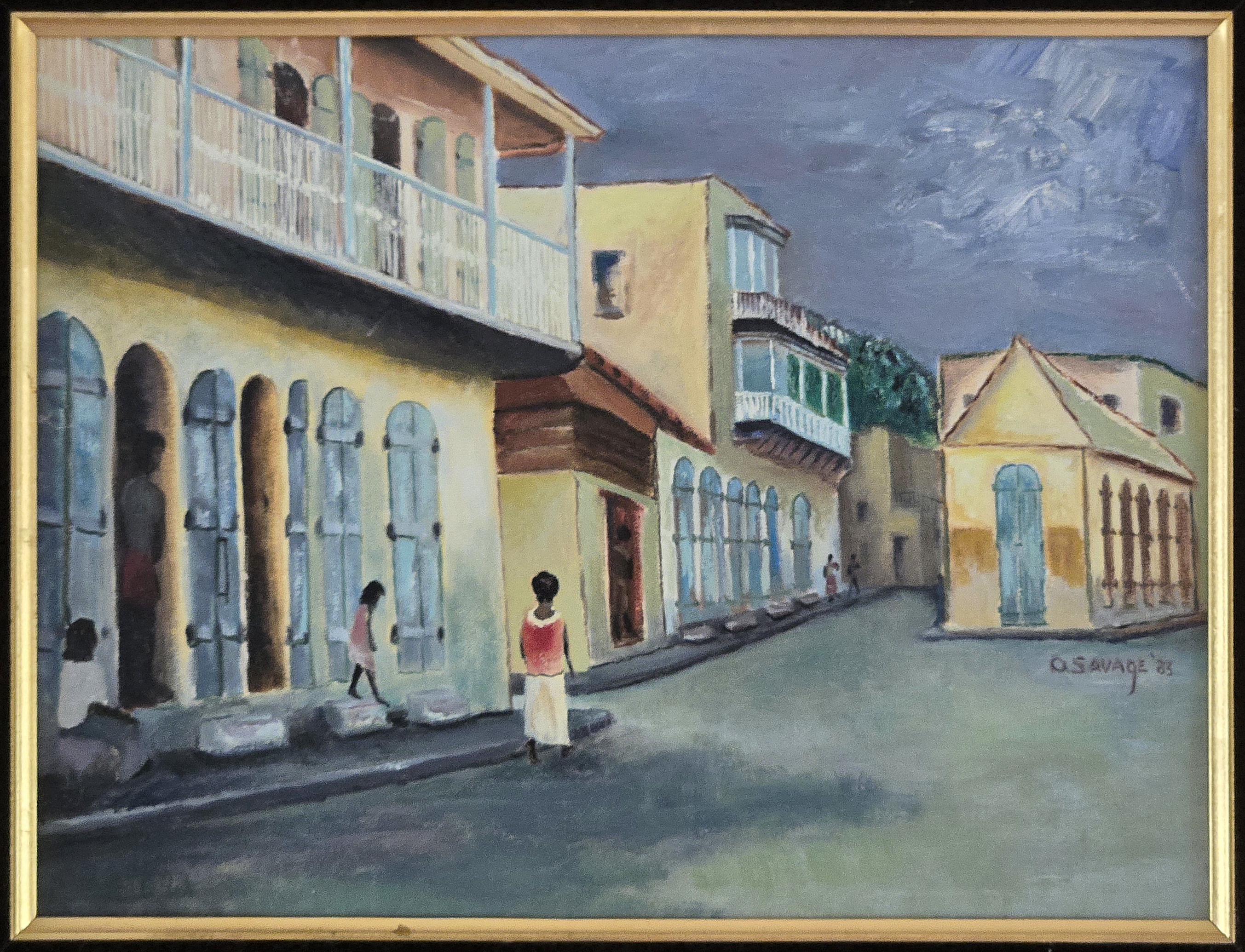
Catalog Information
Title: Port Au Prince Street Scene, Haiti
Date:1983
Medium: Oil on canvas
Dimensions: Approximately 12 x 16 inches
Signature: Signed and dated lower right
Credit Line: Collection of the Artist's Family Description: This narrative landscape depicts a quiet, atmospheric street scene in Port-au-Prince, Haiti, based on a personal slide photograph taken by Dad during a trip in the early 1980s. The composition utilizes a strong diagonal perspective, drawing the viewer's eye down a paved urban street flanked by historical Creole and French colonial architectural structures. Several stylized local figures are integrated into the setting, grounding the scene in the quiet, daily rhythms of the city.
Style & Technique
Rendered in a regionalist, expressionistic style, the work emphasizes form, texture, and mood over rigid realism. He used deliberate, textured brushwork to define the masonry facades and the organic movement of the sky. The rendering of the figures is simplified and elegant, focusing on their silhouettes and integration into the environment.
Color Palette & Light
The color palette is characterized by a sophisticated interplay between warm and cool tones. The buildings feature brilliant ochres and pale yellows, which contrast sharply with the cool cerulean and muted blues of the shuttered doors and balconies. A heavy, stormy violet and deep slate-grey sky dominates the upper register of the canvas, casting a dramatic, diffused light across the street. The deliberate placement of cast shadows on the ground suggests the low sun of a late afternoon just prior to a tropical rain.
Architectural Elements
The painting captures the distinct vernacular architecture of Haiti, including elements of the classic "Gingerbread" style. Notable details include the sweeping second-story wooden balcony with intricate balustrades on the left, paired with tall, arched doorways and louvers designed for tropical ventilation. To the right, a traditional gabled store-front anchors the opposite side of the thoroughfare.
The OSU Influence
Dad's mid-century fine art education at Ohio State University (OSU) deeply informs the formal qualities of Port Au Prince Street Scene. His background manifests in this painting through several key modernist approaches.
- Gestalt Composition: Instead of getting bogged down in documentary realism from his late-1970s photographic slide, Savage translates the alleyway into a unified arrangement of locked geometric shapes. The buildings on the left, center, and right function as heavy structural framing blocks that compress the street space, showing an advanced understanding of formal visual unity.
- Palette Knife Geometry: The dual brush and palette knife technique creates a conversation between soft atmosphere and rigid physical structure. The flat, broad strokes of the palette knife add structural mass to the Caribbean stucco walls, emphasizing the abstract planes of mid-century painting rather than delicate ornamental texture.
- Expressive Tonalism: The deep, overcast, stormy gray sky contrasts sharply against the pale-yellow architecture. The decision to prioritize a dramatic, brooding mood over standard tropical brightness reflects the post-war painting ethos taught in American universities during the late 1940s, where color and value were used to convey psychological weight.
Kennesaw Mountain, Georgia
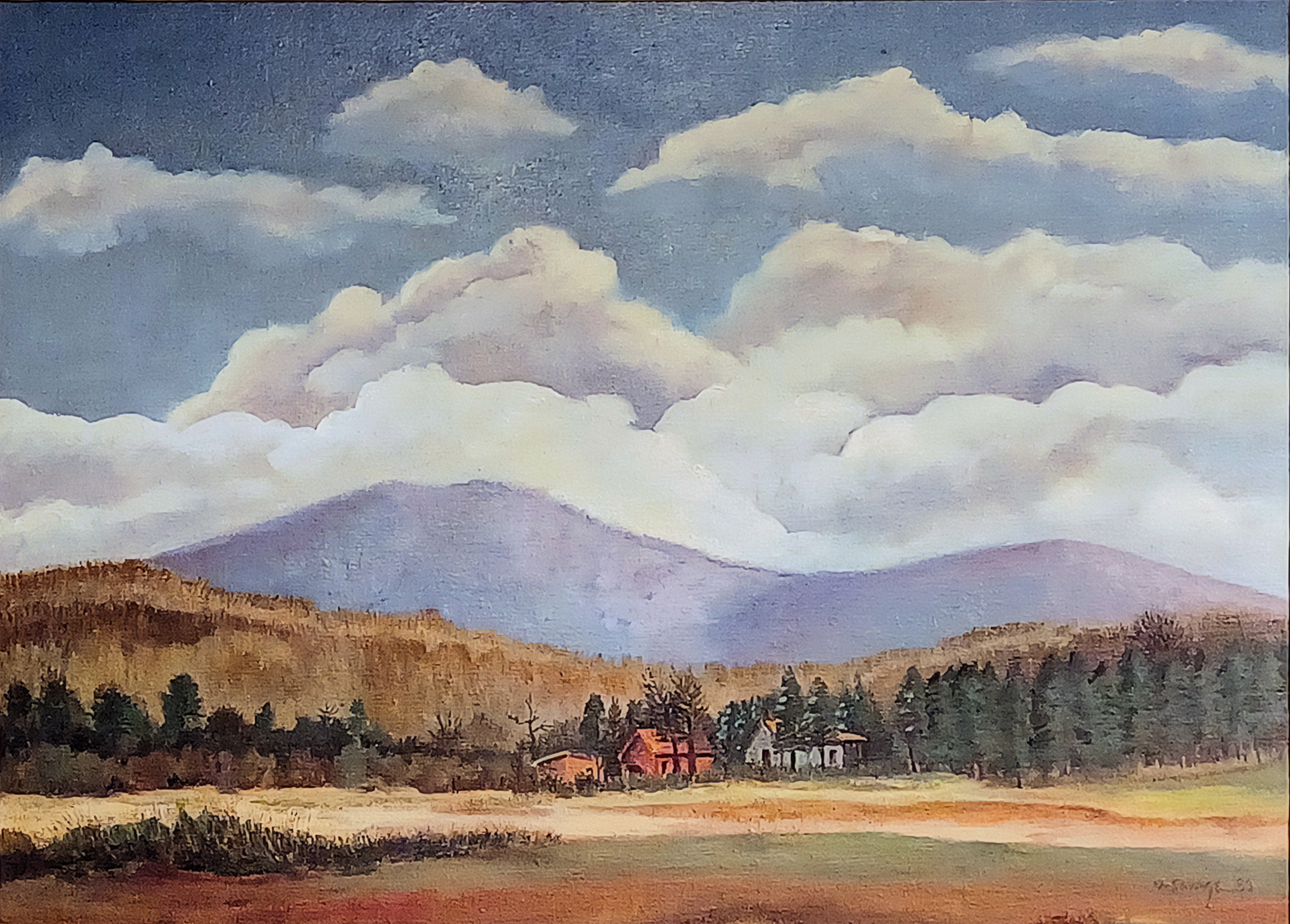
Catalog Information
Title: Kennesaw Mountain, Georgia
Date: 1983
Medium: Oil on canvas
Dimensions: Approximately 24 x 18 inches
Signature: Signed and dated in the lower right quadrant
Credit Line: Collection of the Artist's Family
Description: A sweeping, atmospheric landscape capturing Kennesaw Mountain, Georgia, as viewed from the edge of McCollum Field (McCollum Airport). The composition frames a remote red farmhouse and outbuildings nestled snugly along a dense, dark green tree line. Beyond the valley rises the soft, violet-blue mass of Kennesaw Mountain, dramatically crowned by a heavy, monumental blanket of rolling low clouds.
Painted in 1983, this work is a quintessential example of Dad's late mature period. The piece was developed from a 35 mm slide captured by the artist in Kennesaw. The sophisticated spatial construction and structural harmony displayed in the landscape trace their roots back to hiss formal art education at Ohio State. We can see the subtle imprint of this structural training in how he balanced the composition:
- Structured Spatial Planes: Rather than getting bogged down in microscopic details, the image is parsed into large, readable masses--the sweeping foreground field, the dark horizontal band of trees, the soft geometry of the houses, the swelling volume of the mountain, and the weight of the cloud layer.
- Harmonized Color Relationships: The palette shows a highly educated understanding of color theory. The warm, earthy tones of the foreground and the red farmhouses are balanced against the cool, atmospheric blues and purples of the mountain and sky, creating an organic sense of depth and visual unity.
Dad's Mature Style (1976-1983)
The work beautifully captures the hallmark traits of a "later period" mature style. While his student years focused on immediate perception and formal exploration, his return to painting in the late 70s and early 80s shows a confidence in blending American Regionalism with expressive, texturally diverse paint application.
- Dual-Technique Mark Making: The sophisticated combination of smooth brushwork and bold palette knife applications gives the canvas a rich tactile quality. The brushwork allows the clouds to feel soft, voluminous, and rolling, while a crisp palette knife application yields structure to the farm buildings and the dense, textural weight of the forested foothills.
- Atmospheric Realism via Photography: Working from a 35 mm slide taken at McCollum Airport, he successfully translated a mechanical snapshot into a deeply felt, atmospheric experience. The massive cloud structure pushing down over the mountain creates a dramatic counterpoint to the quiet, domestic safety of the tiny red houses nestled below. It elevates a local Georgia vista into something timeless and monumental.
Everett Early Inc.
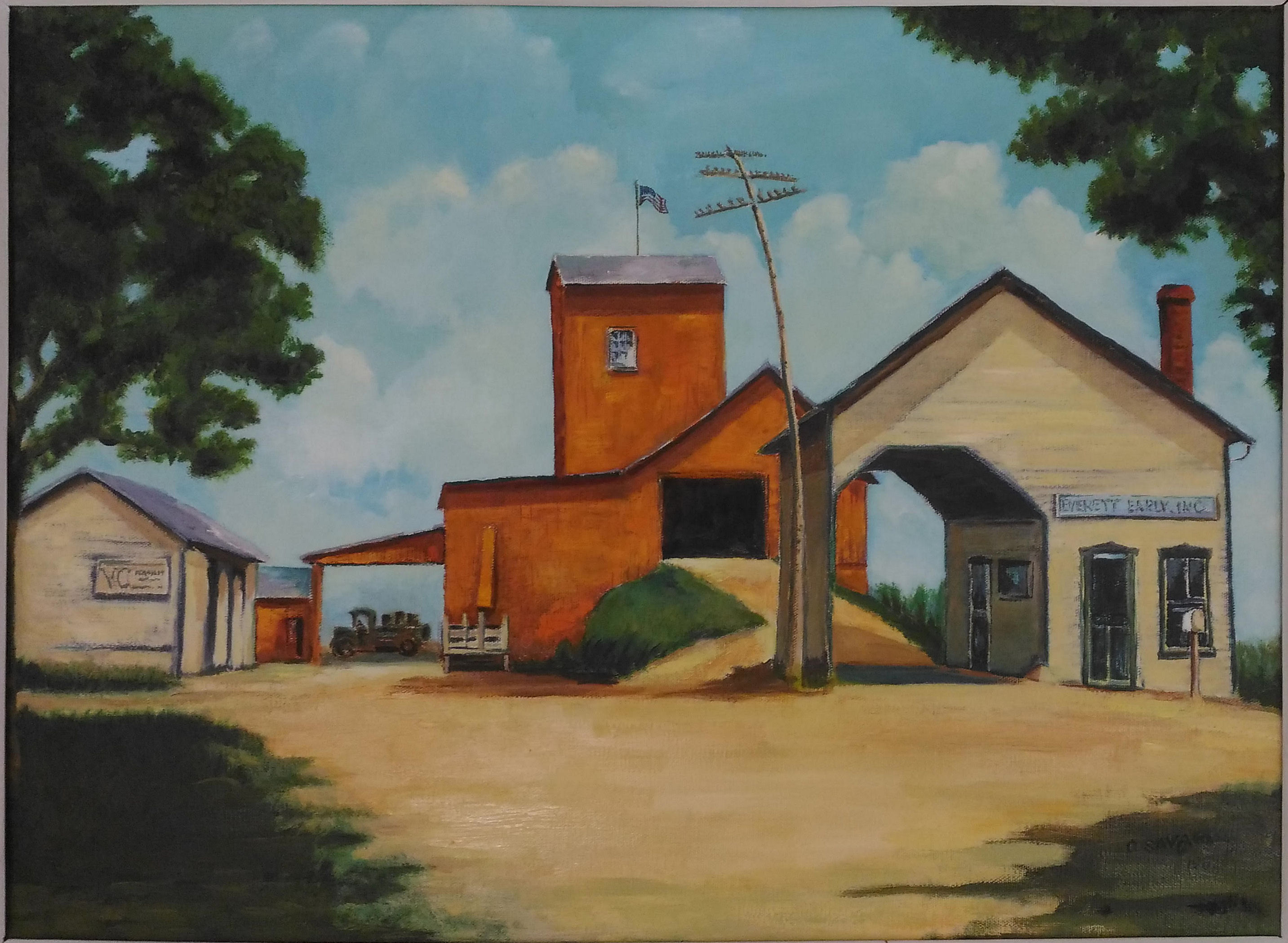
Catalog Information
Title: Everett Early Inc.
Date: 1984
Medium: Oil on canvas
Dimensions: Approximately 24 x 18 inches
Signature: Signed and dated in the lower right quadrant
Credit Line: Collection of the artist's family, donated to The Museum at the Friends' Home, Waynesville, Ohio in 2019.
The painting presents a comprehensive narrative layout of the Everett Early, Inc. feed mill, a vital agricultural hub in the rural community of Lytle, Ohio. The right foreground features the white-sided main office and drive-through scales building, prominently displaying the company name on a hand-painted sign. The center is anchored by a massive, multi-tiered orange grain elevator and storage tower topped with an American flag, complete with an earthen ramp leading to a secondary loading bay. The background and other elements include a lean-to garage housing a period-accurate utility truck, a secondary white outbuilding with signage, a leaning utility pole with crossarms, and mature deciduous trees that frame the composition.
Historical Context and Provenance
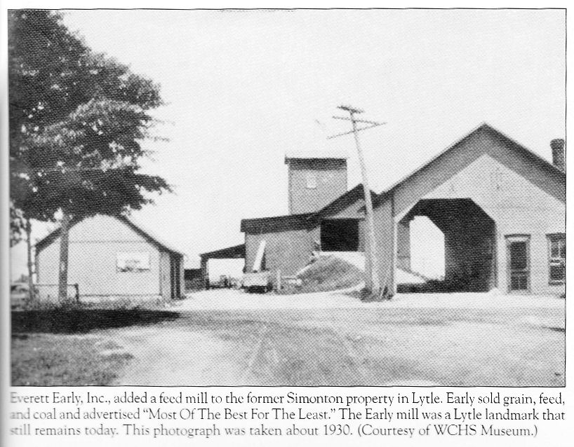
Waynesville and Wayne Township (p. 123)
by Dennis E. Dalton (2012).
Arcadia Publishing, Charleston, SC.
This artwork serves as a vital piece of local visual history, documenting a bygone era of Midwestern American agriculture. Painted in 1983, the work is a retrospective reconstruction. Dad meticulously translated a historical 1930s black-and-white photograph into full color. The original photograph was captured by his foster mother, Addie Kendrick, and is now preserved in the archival collections of the Warren County Historical Society. Because Dad was born and spent the first nine years of his life in a house directly across the street from the mill--where his own father was employed--the vivid orange and white color palette relies entirely on firsthand childhood memories, providing a rare and authentic color record of the site. And in a way, with this final painting he completed his circle of life--it reflected some of his earliest childhood memories.
Artistic Style and Technique
This last of Dad's paintings is executed in a regionalist, representational style common in mid-to-late 20th-century American folk and community art.
- Composition: Dad utilized a wide, low-angle perspective, inviting the viewer into the dirt forecourt of the mill and creating a strong sense of place and scale.
- Color Palette: Dominated by the high-contrast juxtaposition of the warm, earth-toned orange elevator against the crisp whites of the surrounding offices, set under a soft, cloud-filled blue sky.
- Application: The oil paint is applied with visible, deliberate brushstrokes that give texture to the wooden siding, the gravel drive, and the foliage, emphasizing a rustic, hand-hewn quality.
- Lighting and Atmosphere: Soft, diffused daylight casts gentle shadows across the scene, evoking a nostalgic, serene atmosphere that honors the dignity of rural labor and community heritage.
Summarizing Dad's Artwork
Evaluating Dad's talent and quality requires looking past the traditional metric of commercial gallery success and judging him instead as a highly skilled, academically disciplined practitioner of mid-century American Modernism. He was not an isolated amateur, but a deeply capable artist whose work reflected the elite visual training of post-war academia.
Technical Execution and Material Mastery: High Quality--He possessed excellent technical control over difficult mediums, specifically oil paint applied with a palette knife.
- The Mastery of Impasto: His early work shows he was highly skilled at a technique called "bricking." Instead of blending colors smoothly, he laid down distinct, sculptural tiles of thick paint that retained their shape. This requires immense confidence; one wrong stroke with a heavy steel knife can muddy an entire canvas. Structural Composition: His paintings never collapse into chaotic mess. In works like Big Four Railway Bridge, his layout is rock-solid. He had a sharp eye for geometric balance, successfully using hard industrial lines to cut through and anchor soft, organic landscapes.
Conceptual Adaptability: The Shift from Mass to Light -- A major indicator of his artistic quality is his ability to completely reinvent his style later in life, while still remaining grounded in his early academic training.
- The Early Period (1940s-1950s): Focused on matter and weight. He pushed paint around with physical force to capture the grit of Ohio's industrial boom in
(1947) and Big Four Railway Bridge Sidney, Ohio (1954). Paintings like The Tree Trunk (1954) show what the post-war OSU style was all about. Built entirely with a palette knife, the oil paint is thick, sculptural, and full of raw, directional energy. In Still Life with Foliage and Fruit (1949), he used a tight "bricking" technique--small, rectangular dabs of the knife--to build a dense foliage mosaic that feels incredibly solid. By matching the heavy texture of the foreground with a flat, metallic background, he deliberately squashes the depth of the room, showing a student eagerly testing out modern rules of flatness. - The Late Period (1970s-1980s): Focused on light and space. He successfully put away the heavy knife and picked up fluid bristle brushes, proving he could handle delicate, atmospheric transparency and complex shadow work. The Florida and European works from the late period show a painter who no longer felt the need to prove himself with brute force or thick paint. Mom at Coquina Beach (1982) is beautifully constructed. The vertical palm trees cut across the sand like structural pillars, slicing the canvas into neat geometric zones while a lone figure in white looks out at the open Gulf. The harsh, stark shadows map out the ground with a quiet, meditative stillness. The archive closes perfectly with Everett Early Inc. (1984) -- a retrospective piece where Dad took a 1930s black-and-white photograph of the feed mill across from his childhood home and painted it using high-contrast orange and white tones drawn purely from memory. It is clean, balanced, and serves as a fine final testament to a lifetime of balancing formal design with a deep love for local landscapes.
Historical and Cultural Value: A Vital Conduit -- While Dad was not a pioneering innovator who changed the course of global art history like his OSU instructor Roy Lichtenstein, his talent lies in his role as an exceptional regional conduit.
- He perfectly absorbed the radical, cutting-edge theories of visual perception taught at Ohio State University under Hoyt Sherman and Manuel Barkan.
- Instead of letting those ideas fade when he left the university, he internalized them and spent decades passing that refined artistic standard down to public school students in the Midwest.
Final Critique
Orville Savage was an artist of high technical quality and profound regional importance. His work stands as an exceptional example of post-war American Regional Expressionism. He took the high-minded, abstract art theories born in university laboratories and successfully applied them to the honest, everyday landscapes of the American Heartland.
Notes
- Note 1 U.S. National Archives and Records Administration, "Servicemen's Readjustment Act (1944)," Milestone Documents, last modified February 8, 2022, https://www.archives.gov/milestone-documents/servicemens-readjustment-act. Accessed 6/24/2026.
- Note 2 ARV_UREG_Information_For_Prospective_Students_1947-1948-1.pdf https://kb.osu.edu/server/api/core/bitstreams/cf3fa66d-0727-59b8-9940-9f9c2ae06ce4/content. Accessed 6/24/2026.
- Note 3 Hoyt L. Sherman. https://grokipedia.com/page/hoyt_l_sherman. Accessed 6/24/2026.
- Note 4 Sherman, Hoyt L. Drawing by Seeing: A New Development in the Teaching of the Visual Arts Through the Training of Perception. New York: Hinds, Hayden & Eldredge, 1947. Sherman's "Flash Lab" operated as a completely darkened classroom where images were projected for a mere fraction of a second (usually 1/10th of a second), forcing students to draw the "afterimage" left on their retinas. Developed in the 1940s, this radical teaching method merged perceptual psychology with visual art. It aimed to train students to comprehend an entire composition instantly rather than focusing on separate, disconnected parts.
- Note 5 Manuel Barkan, A Foundation for Art Education (New York: Ronald Press Co., 1955).
- Note 6 Manuel Barkan (1913-1970) https://education.stateuniversity.com/pages/1781/Barkan-Manuel-1913-1970.html. Accessed 6/24/2026. After World War II, Dr. Manuel "Manny" Barkan revolutionized art education at The Ohio State University by transforming it from a casual hobby into a rigorous academic discipline. Joining the faculty in 1947 and later serving as the inaugural chair of the Division of Art Education, Barkan championed the "studio-as-discipline" approach, urging students to work with the depth and perseverance of practicing artists. As the intellectual grandfather of Discipline-Based Art Education (DBAE), he pioneered a comprehensive curriculum that integrated art production, history, criticism, and aesthetics, all while maintaining a deep commitment to social and humanistic values. Today, his legacy survives at OSU through foundational textbooks and the Manuel Barkan Endowed Fellowship Fund, which continues to support groundbreaking doctoral research.
- Note 7 The Roy Lichtenstein Foundation, "Biography," lichtensteinfoundation.org/biogrpahy/. Accessed June 24, 2026. Roy Lichtenstein began his student career at Ohio State University in September, 1940, but it was interrupted by service in the U.S. Armuy in 1943. Following his World War II service, he returned to OSU from 1946 to 1951 as a graduate student and studio art instructor, leaving a lasting mark on the School of Fine and Applied Arts. Deeply influenced by his mentor Hoyt L. Sherman, Lichtenstein taught a perception-based approach to design, utilizing "flash lab" darkroom techniques to train students to view compositions as unified structural wholes rather than isolated details. His early academic synthesis of formal composition and American imagery laid the groundwork for his legendary Pop Art career. Today, his legacy endures on the OSU campus through major foundational endowments, a dedicated studio art center, and his monumental Modern Head sculpture.
- Note 8 Regionalism (art). https://en.wikipedia.org/wiki/Regionalism_(art). Accessed 6/24/2026. Regionalism was an influential American modern art movement of the 1930s that rejected European abstraction to focus on realistic, narrative depictions of rural life and the American heartland. Led by artists Grant Wood, Thomas Hart Benton, and John Steuart Curry, the movement responded to the Great Depression by capturing the resilience, labor, and landscape of the Midwest with technical precision and emotional resonance. Its major contribution to modern art lies in its democratic challenge to elite, urban art institutions and its creation of a distinct national aesthetic. By elevating everyday American subjects into high art, Regionalism expanded the definition of modernism, bridged the gap between the public and the art world, and paved the way for later narrative styles, including the social commentary of American Realism and the scale of Abstract Expressionism.
- Note 9 Exploring Paul Cézanne: The Post-Impressionist Who Shaped Modern Art. https://www.artsloth.in/post/exploring-paul-c%C3%A9zanne-the-post-impressionist-who-shaped-modern-art. Accessed 6/24/2026. Paul Cézanne radically transformed the art world by acting as the essential bridge between 19th-century Impressionism and 20th-century Cubism. Rejecting the fleeting light effects of his contemporaries, he focused on the underlying structural geometry of nature, famously treating its forms through the cylinder, the sphere, and the cone. His innovative use of analytical brushstrokes and shifting, multi-perspective viewpoints disrupted traditional three-dimensional illusionism. This profound shift directly inspired masters like Pablo Picasso and Henri Matisse, cementing Cézanne's legacy as a foundational father of modern art. His still life paintings with apples and fruit were the ultimate testing ground for his artistic revolution. Because fruit does not move, wilt quickly, or change with the shifting outdoor sun, it allowed him the immense time required to analyze physical reality and completely reinvent how space is represented on canvas.
- Note 10 Paul Gauguin. https://www.theartstory.org/artist/gauguin-paul/. Accessed 6/24/2026. Paul Gauguin fundamentally transformed Post-Impressionism by rejecting traditional Western naturalism in favor of Primitivism and Synthetism, styles defined by flat planes, bold colors, and symbolic meaning. His influential Tahiti nude paintings--such as Tahitian Women on the Beach and Where Do We Come From? What Are We? Where Are We Going?--redefined the genre by portraying the female form through a non-European lens, blending raw sensuality with spiritual mysticism. By abandoning realistic perspective and academic proportions, Gauguin used these idealized, expressive figures to critique modern industrialization and capture an exoticized, untamed paradise. This radical shift away from literal representation directly paved the way for 20th-century avant-garde movements like Fauvism and Cubism, cementing his legacy as a pioneer of modern art.
- Note 11 >The Florida Highwaymen. https://www.floridahighwaymenpaintings.com. Accessed 6/24/2026. The Florida Highwaymen fundamentally shaped the post-war art scene by introducing a unique regional landscape style and a revolutionary, self-sustained business model that bypassed Jim Crow-era segregation. This loose collective of 26 African American artists (including one woman, Mary Ann Carroll) emerged in the mid-1950s around Fort Pierce, Florida. Debarred from white-owned galleries due to systemic racism, they achieved economic self-determination by selling over 200,000 paintings directly from the trunks of their cars along U.S. Route 1 and State Road A1A. Initially dismissed by traditionalists as commercial "motel art," the movement is now celebrated as "The Last Great American Art Movement of the 20th Century". Their work heavily influenced the Florida residential regional art tradition. In 2004, the entire group was formally inducted into the Florida Artists Hall of Fame. Today, their paintings are highly sought-after collector's items and are prominently displayed in institutions like the Smithsonian National Museum of African American History and Culture.
- Note 12 Group of Seven Canadian artists. https://www.britannica.com/art/Group-of-Seven-Canadian-artists. Accessed 6/24/2026. The Group of Seven revolutionized Canadian art in the post-WWI era by launching the nation's first distinct visual movement. By rejecting traditional European academic styles, they captured the rugged majesty of the Canadian wilderness through bold Post-Impressionist techniques, vibrant colors, and striking geometric simplification. Their dramatic landscapes fostered a powerful sense of national identity and cultural independence. Ultimately, their work laid the foundation for modern Canadian art, transforming how the country saw itself and cementing the wilderness as a defining pillar of Canada's heritage.
- Note 13 Chaïm Soutine, Lithuanian Painter. https://www.theartstory.org/artist/soutine-chaim/. Accessed 6/24/2026. Chaïm Soutine was a pivotal figure in the School of Paris whose raw, emotionally charged style significantly advanced the development of modern Expressionism. Rejecting academic traditionalism, he transformed classical genres--such as portraiture, landscape, and still life--into turbulent visual experiences defined by violent brushwork, distorted forms, and a vivid, often visceral color palette. His intense, tactile application of paint and profound vulnerability bridged early 20th-century European Expressionism with postwar American art.
- Note 14 Hans Hofmann. http://www.hanshofmann.org/. Accessed 6/24/2026. Hans Hofmann was a pivotal German-American artist and educator whose innovative theories and vibrant paintings fundamentally shaped the trajectory of American Abstract Expressionism. Renowned for his celebrated "push-pull" theory, Hofmann demonstrated how contrasting colors, shapes, and textures could interact to create a dynamic sense of depth and movement on a flat canvas without relying on traditional perspective. As a master painter, his work seamlessly bridged European modernism--incorporating elements of Fauvism and Cubism--with the raw, spontaneous energy of the New York School. Beyond his own prolific studio practice, Hofmann's legendary art schools in Munich and New York served as vital incubators for the post-war avant-garde. His dual legacy as a visionary theorist and a pioneering painter solidifies his reputation as one of the most influential forces in 20th-century modern art.
- Note 15 The Ashcan School. https://www.theartstory.org/movement/ashcan-school/. Accessed 6/24/2026. The Ashcan School was a revolutionary American art movement of the early 20th century that laid the groundwork for modern art by challenging academic traditions. Led by artist Robert Henri, this loose collective of painters captured the raw, unvarnished realities of rapidly growing cities, focusing on immigrant neighborhoods, bustling street scenes, taverns, and crowded tenements. By shifting the subject matter away from idealized, upper-class portraiture toward the gritty truths of everyday working-class life, they redefined what was considered worthy of fine art. Their loose, sketchy brushwork and dark, expressive color palettes mirrored the vitality and chaos of modern urbanization. Ultimately, the Ashcan School's rebellious spirit and commitment to artistic freedom broke the chokehold of traditional academies, paving the way for the radical abstraction and independent spirit of subsequent American modernists.
- Note 16 Charles E. Burchfield. https://en.wikipedia.org/wiki/Charles_E._Burchfield. Accessed 6/24/2026. Charles E. Burchfield was a visionary American painter who transformed the landscape genre by infusing everyday scenes with profound, mystical emotion. Best known for his expressive watercolors of the American Midwest and Northeast, Burchfield rejected conventional realism in favor of a unique, highly individualistic style that captured the invisible forces of nature--such as the vibration of sound, the intensity of light, and the shifting of seasons. His early work featured haunting, stylized depictions of childhood memories and industrial towns, while his late career saw a dramatic return to monumental, semi-abstract nature paintings defined by repeating calligraphic strokes and a vivid, pantheistic energy. By elevating watercolor to a scale and intensity typically reserved for oil painting, Burchfield bridged the gap between traditional American regionalism and European expressionism, securing his place as a pioneer of American Modernism.
- Note 17 Edward Hopper. https://en.wikipedia.org/wiki/Edward_Hopper. Accessed 6/24/2026. Edward Hopper was a seminal American realist painter whose work profoundly shaped modern art by capturing the profound solitude, alienation, and quiet introspection of 20th-century urban and rural life. Rejecting the abstract trends of his contemporaries, Hopper used stark geometric compositions, dramatic contrasts of light and shadow, and isolated human figures to reflect the psychological landscape of a rapidly changing America. His cinematic framing and mastery of light--most famously captured in his masterpiece Nighthawks--transformed ordinary spaces like diners, gas stations, and hotel rooms into hauntingly beautiful, emotionally resonant narratives. By elevating the mundane and exposing the underlying anxiety of the modern human condition, Hopper bridged the gap between traditional realism and modern psychological expression, deeply influencing generations of painters, filmmakers, and photographers.